Single Source of Truth: The Tableau Pulse Metric Layer
In the current state of the analytics landscape, we’re often dealing with an overwhelming amount of reporting. Dashboards, tables, external reporting tools, there are dozens of ways to try to get to the same information. You’re probably hearing all about agents, and AI, enhancing your reporting, but what if you don’t even know what data IS your reporting?
Tableau has stepped in with a feature that can finally solve the “single source of truth” challenge. After you’ve plugged in your data, reporting stems from one single concept, the individual metric. Whether you’re in sales, marketing, operations, customer service, or anywhere else, you likely have KPIs and metrics that drive your decisions. Some of these likely have targets and commissions tied to them. We need to get these numbers right! That’s why Tableau introduced the “metric layer.”
What is the Metric Layer?
The metric layer is the name of the space where your Tableau Pulse metrics will live. In Tableau, on the right sidebar you’ll see the Tableau Pulse button which will take you to the Tableau Pulse metric home page. Here, you’ll see the metrics you follow as well as all the other metrics you have permission to view. This page is the hub of the metric layer. Here, analysts can create new Pulse metrics by connecting to published data sources
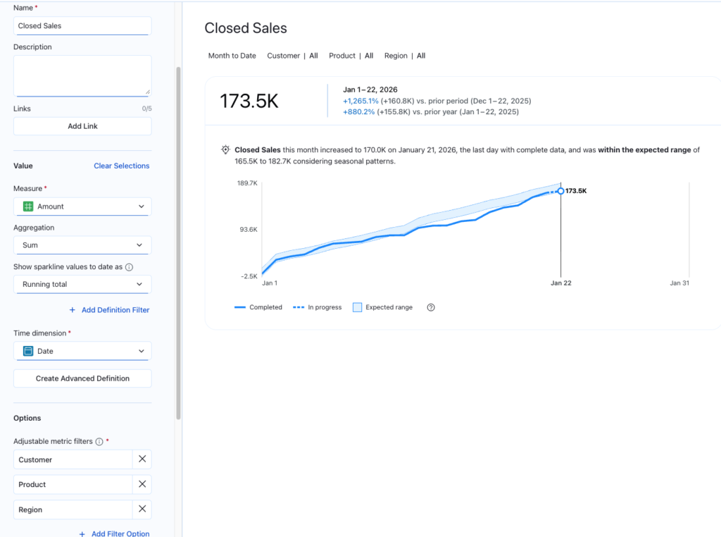
Defining a metric in Pulse is a departure from the old way of writing complex code. Instead of building a “chart,” you are building a Definition.
- Select your Measure: You start with the core value, such as “Order-to-Ship Latency” or “Total Sales.”
- Set your Time Element: You choose the time dimension that matters (“Order Date,” “Close Date,” etc) and define the standard comparison, like Month-to-Date or Year-over-Year.
- Apply the Business Semantic: Here, you define the sentiment of the change (Is an increase “Good” or “Bad”?).
- Set the Dimensions: You choose which filters users are allowed to use to “slice” this metric (e.g., by Region, by Hub, or by Product Category).
- Provide Record Context: Pulse metrics require you to define what a single row could be identified by, usually an ID field.
That’s as easy as it is to establish your Pulse metrics. Once defined, this metric is open to be integrated into the flow of work, or directly into your dashboards. See below for the Closed Sales Pulse metric definition:
Define once, use everywhere
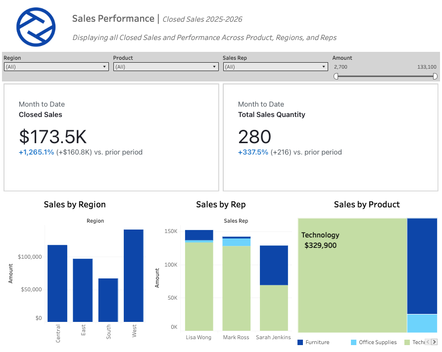
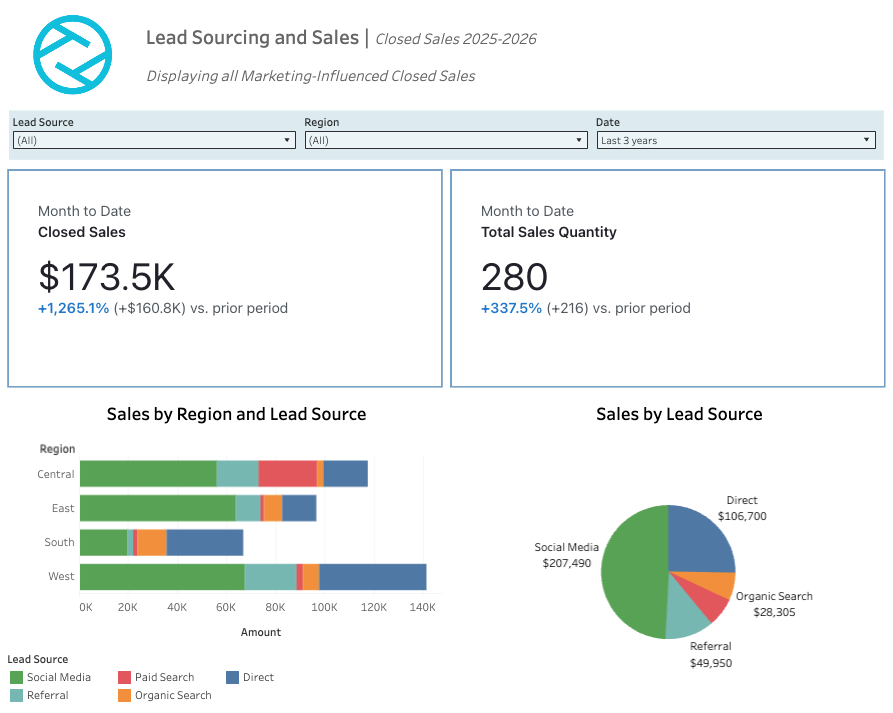
You’ve probably heard the term “headless” BI more and more these days, but it is far from just a buzzword. Headless BI means that the logic of a pulse metric exists outside of the visual. Once you’ve defined a metric, like we did with Closed Sales earlier, it becomes a portable Metric Object that can now be used anywhere across your organization. Below are a list of just some places where your metric that we defined just once can be integrated and utilized:
- On Your Phone: Pulse metrics are designed to be on-the-go. Using the Tableau app, Pulse metrics are available at your fingertips, showcasing KPIs, trends, and drill-downs, without the need to open up your desktop.
- In the Flow of Work: Pulse metrics can be added directly to your collaborative environments. With applications and extensions for Salesforce, Microsoft Teams, and Slack, these metrics can be shared directly with individuals across the organization.
- In Your Email: Subscriptions are a key component of Pulse metrics. By “Following” the metric, these metrics can appear in your inbox daily. Even key insights and anomalies will be called out in natural language directly in the email.
- Back in the Dashboard: Perhaps the most impactful component of Pulse Metrics, They can be integrated directly into your Tableau dashboard just as you would place a chart, or table. This integration allows for the metrics to truly be headless, and remain consistent across all reporting.
What are the expected impacts?
The idea of a universal metric should be pretty enticing, but what have we seen in organizations that have adopted this metric layer for their reporting? The savings and impact may be broader than you think:
- No More Number Conflict: How often have you spent time working with individuals from other teams diving into understanding the numbers in your dashboards? What if Marketing and Sales find different Sales results? Now, both teams are using the same metric, removing any conflict.
- Reduction in Technical Debt: If a metric definition changes, that change is changed once, in the Pulse metric definition. This change will flow through to all integrated dashboards, and spaces, ensuring everyone is still on the same page instantly.
- Increase in Speed to Insight: Because this layer is proactive, users aren’t hunting for data anymore, they are simply responding to the same insights. This shifts your analytics team from simply report builders, to strategic advisors.
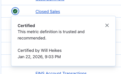
- Metric Layer becomes the Trust Layer: By certifying your Pulse metrics (in the governance set of Metric Definition of step 1), users can build confidence in their Pulse metrics, which eventually will lead to a culture of data.
Why centralize your business logic in the Metric Layer?
The introduction of the Metric Layer is the shift in how we think about data strategy. We are moving away from an era where users had to go “hunting” for answers in a forest of static dashboards. Instead, we are building a foundation where the data finds the user.
By centralizing your business logic in the Metric Layer, we aren’t just cleaning up your reporting, we are building an AI-ready infrastructure. Whether you are using Pulse today or preparing for the AI agents of tomorrow, the Metric Layer ensures that your “single source of truth” is actually true.
The dashboard isn’t going away, it’s just getting a promotion. It is no longer the place where you go to find out what happened—it’s the place where you go to decide what to do next.