Streamgraph 101: Visualizing Lollapalooza Festival Trends in Tableau
Lollapalooza was founded in 1991 as a touring music event before settling in Chicago as its permanent location in 2005. The festival was initially founded as an alternative and rock music festival, with an especially strong electronic and hip-hop presence.
However, as the festival has continued to grow and become more mainstream, it began to feature headliners from other genres, including pop, R&B, and K-pop. Here we’ll explore how to visualize this change through the development of a streamgraph visualization.
What is a streamgraph chart?
A streamgraph chart is a type of stacked area chart that displays changes in data categories over time, usually characterized by flowing, organic shapes (like a stream) centered around a central axis rather than a flat baseline. Streamgraph charts are intended to highlight changes in specific buckets (in this case music genres) and overall headliner growth over time.
A streamgraph chart also has the added benefit of appearing similar to a “Volume” visual that a DJ would have on his turntable, representing the music aspect of the dashboard. While this may sound like just a nice add-on or funny coincidence, this purpose is important. Visualizing data in a way that reminds the viewer of the analysis at hand drives the point home and keeps it sticky in their mind when recalling the analysis.
The data
For this article, we’ll be using the following data source:
DIM_Acts: A table that includes the year of the particular Lollapalooza, the artist name, their genre, and sub-genre (someone like BLACKPINK’s Jennie would have a genre of pop with sub-genre of K-pop).
To get this into Tableau, we’ll be downloading this data source as a CSV, and uploading it directly into the Tableau dashboard.
The streamgraph chart
For a streamgraph chart, we need three things:
- A time dimension (Festival Date)
- A dimension representing the different segments of the flow (Genre/Sub-Genre)
- A measure to identify the totals (count(rows))
If you look closely, the visual generally looks like a stacked bar chart to start with. The key thing about a streamgraph chart is that we want to have a count of rows both above and below the central line of the chart. What I like to do with this is highlight the areas that are “anomalies” or growing trends. For this analysis, I want to highlight the number of newer genres being added to the lineup. (I.e., pop, country, and reggaeton being added to the more traditional rock, alternative, and electronic music festival.) To do this, I added the following calculated field:
[Count]
     If [Genre] = "Pop" then -1
          elseif [Genre] = "Country" then -1
          elseif [Genre] = "Reggaeton" then -1
          elseif [Genre] = "R&B" then -1
          else 1 end
The goal of this calculation is to pull the number of headliners from these genres to the bottom part of the graph, while keeping the more traditional headliners on the top side.
To build the chart, we’ll pull the Year field onto the columns section, our new Count calculation defined above to the rows, and the Genre column to the colors mark. This will develop the visual below:
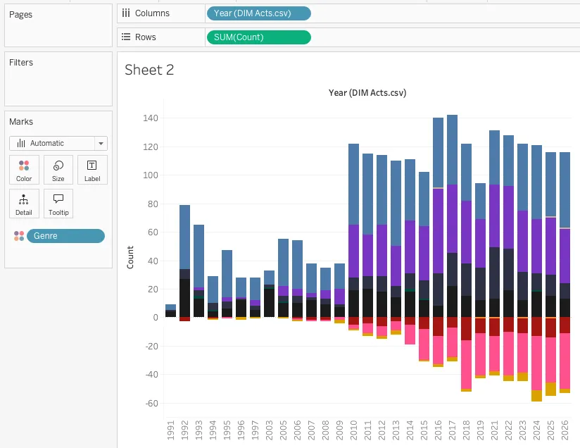
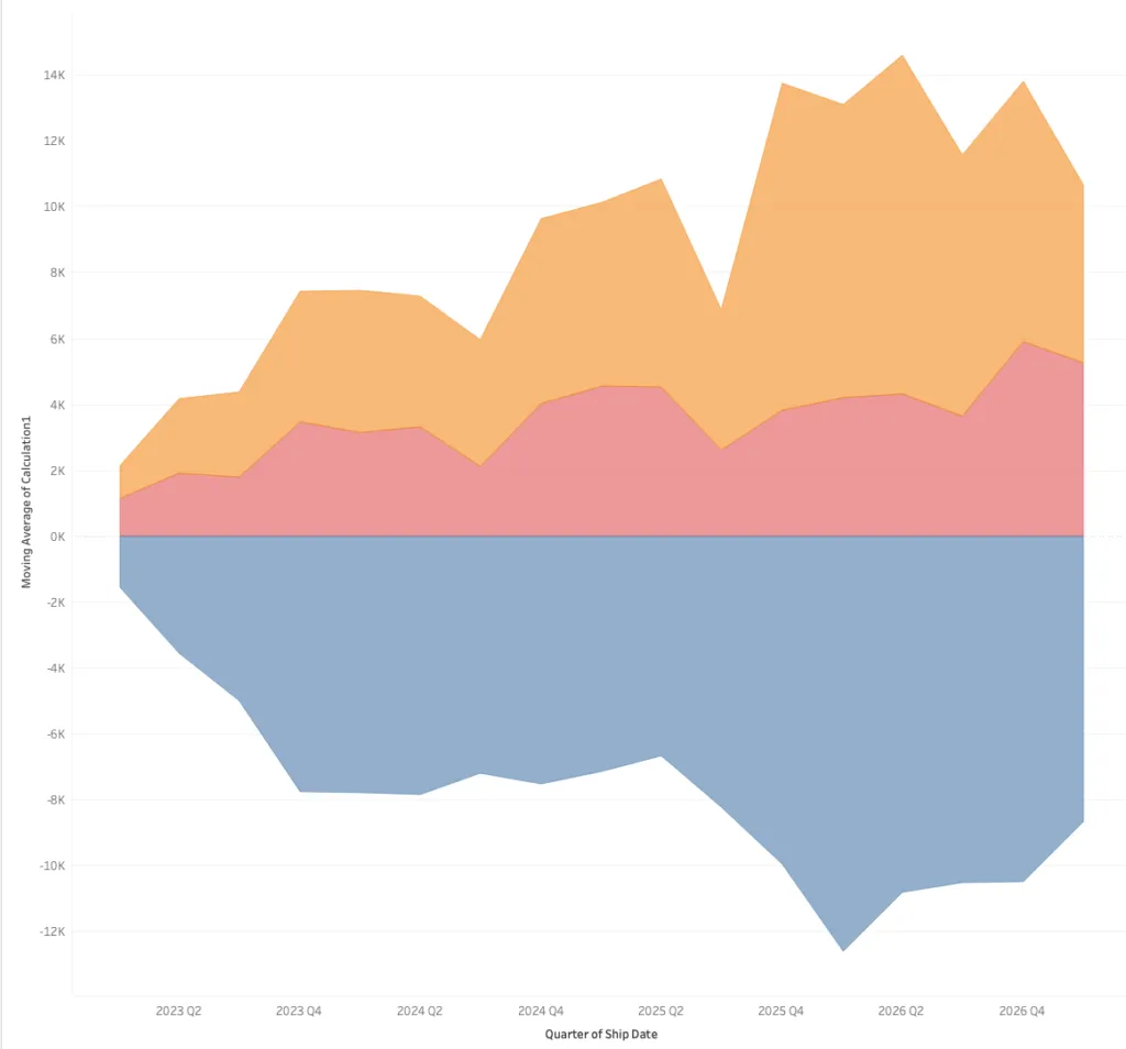
We’re close to transforming this stacked bar into a full streamgraph chart. Next, we’ll change the table calculation to a moving average. This step isn’t 100% necessary, but the benefit of a moving average is that the numbers are scaled to prevent large spikes and drops found in the original data. Adding the moving average doesn’t change the overall visual result other than preventing large-scale outliers from dominating the data. This gives our streamgraph chart a more rounded shape. Right-click on your Count column in the rows shelf and select edit table calculation.
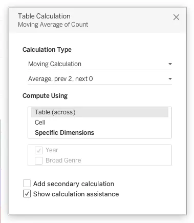
Ensure your table calculation does Table Across to confirm it’s creating this average across all columns, rather than a single column. Once we’ve done this, the last step is to change our visual to an Area graph chart in the Marks card. Right now it’s likely set to bar. The Area graph is what makes the visualization fit our desired “Volume” visual. That’s it, now we have a streamgraph chart that shows the change over time for each genre at the festival since its start back in 1991. From here, we can update our formatting and add it to our final dashboard.
You can even make adjustments to the visual by adding details which include the artist, toggles that swap between the genres and sub-genres, or limiting the visual to only include headliners. But those are topics for another blog.
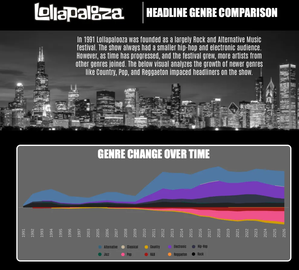
What the streamgraph visualization shows us
The evolution of Lollapalooza from a 90s grunge tour to a global, multi-genre phenomenon is a story of increasing popularity and changing audiences for the music festival. Through the Tableau streamgraph visual, we’re able to visualize the growth of pop, country, and reggaeton music artists performing at the festival to the point that pop is becoming as popular as the original staples of the festival.