Evolution, Not Reinvention: Tableau Dashboards in a Modern BI Strategy
If you’ve been following the evolution of business intelligence over the past few years, you’ve likely heard that AI and natural language queries have pushed the traditional dashboard to the back burner. However, this is far from the case. Despite the rise of automated insights, the traditional Tableau dashboard remains the most critical part of your analytics strategy.
Modern analytics isn’t a choice between Pulse metrics and dashboards. Instead, it is a three-tiered approach to decision-making where each tool has a specific job to do.
The awareness layer: Tableau Pulse
The role of Tableau Pulse is to handle the noise. It acts as a proactive monitor, scanning thousands of data points to find the outliers that require human attention. Rather than asking a user to hunt for a problem, Pulse serves as the curator of information.
For example, consider a fulfillment organization. Market leaders need to know which of their hubs are experiencing shipping delays. Instead of checking a massive report daily, they use a Pulse metric to track Order-to-Ship Latency.
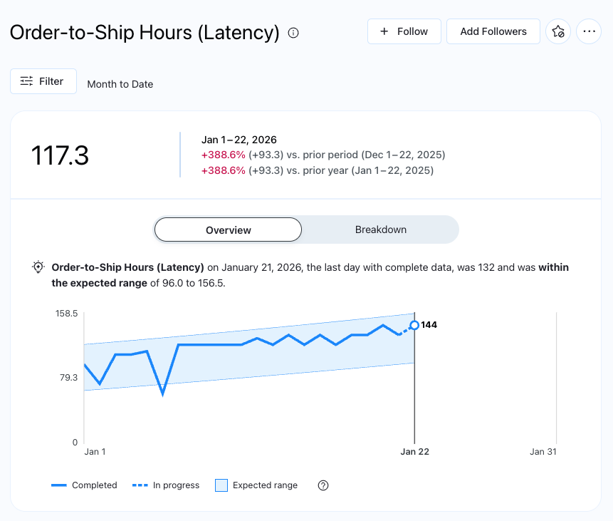
Looking at the metric above, it is clear that latency is increasing throughout the month. At this stage, the user has been alerted to a trend, but they need more context to understand the root cause.
The discovery layer: Enhanced Q&A
This is where Enhanced Q&A enters the workflow. Now that the leaders know latency is up, they can explore the “why” by interacting directly with the metric using plain English. Questions like Which fulfillment hub has the highest latency? or What products are driving these delays? allow them to dive deeper into the data.
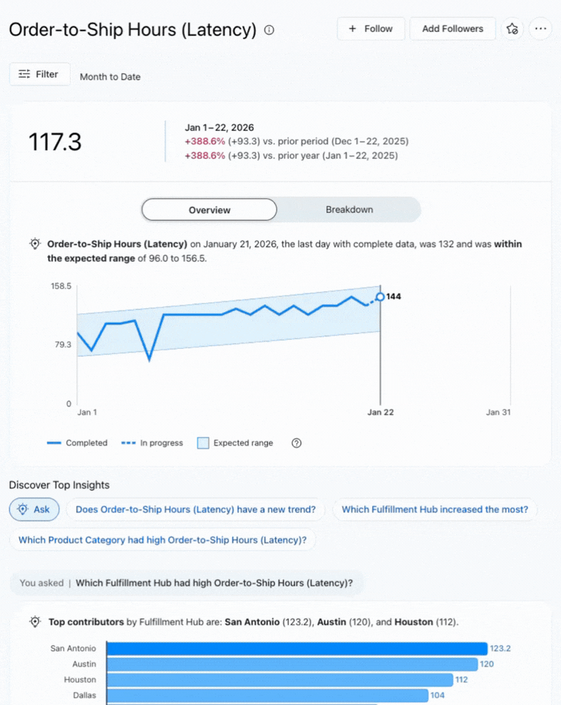
This discovery phase turns a vague alert into targeted intelligence. By the time the user moves to the next step, they aren’t just looking for problems—they are looking for specific solutions.
The action layer: the Tableau dashboard
Now that the team knows where the problems are located, they are ready to take action. This is where the traditional Tableau dashboard becomes the hero of the story. While Pulse and Q&A help us understand what happened, the dashboard allows us to see the big picture and plan the path forward.
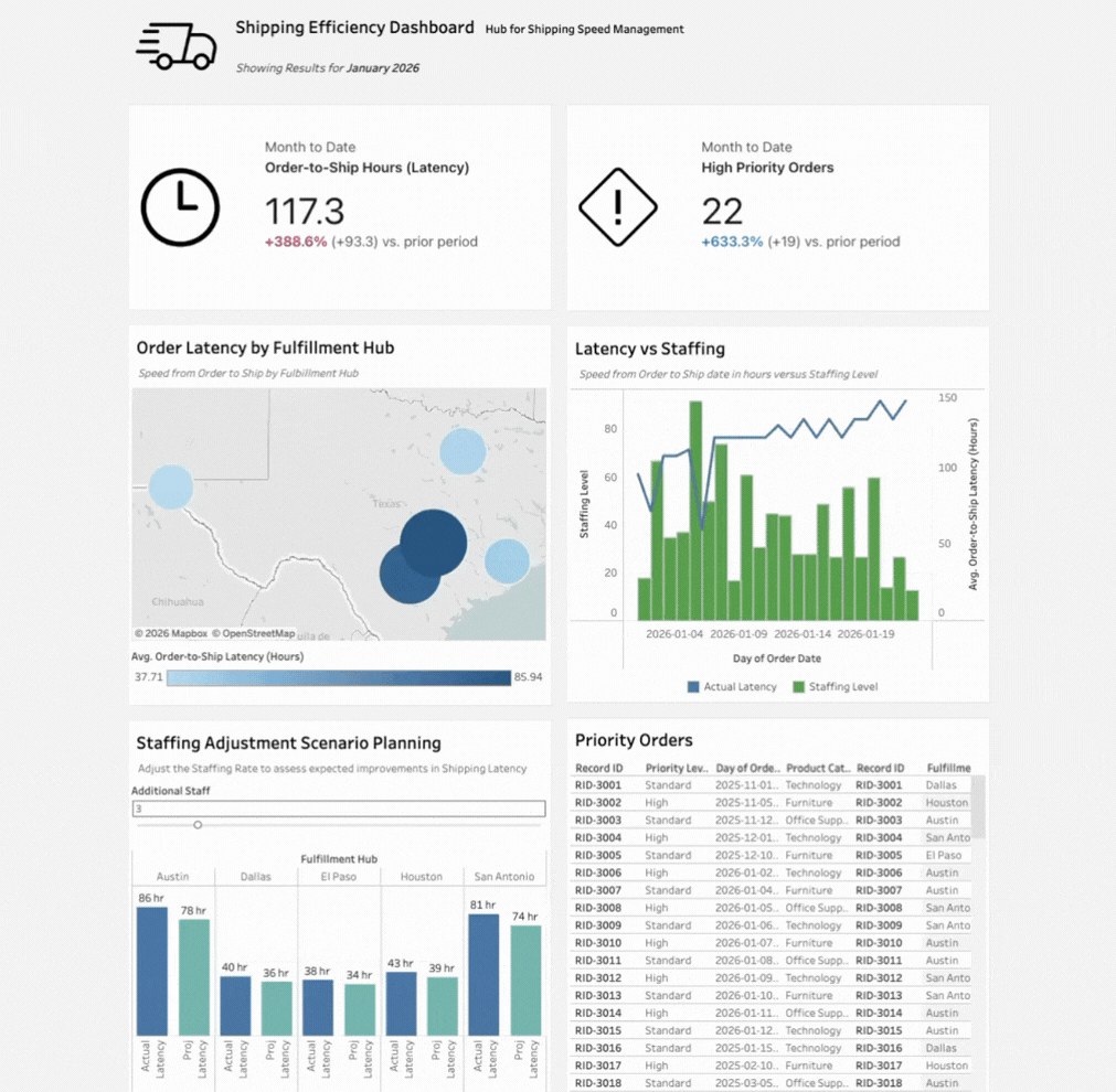
As we navigate to the dashboard, you’ll notice something important: the Pulse metrics for Latency and Priority Orders appear directly at the top. This integration ensures that the “single source of truth” established in Pulse remains consistent throughout the entire ecosystem.
The true power of the dashboard appears in its ability to scenario plan in real time. By making adjustments to staffing levels via a slider, managers can see how reallocating resources will impact fulfillment speed across different regions. We see a map identifying geographic bottlenecks paired with a combo chart that visualizes the direct correlation between staffing drops and latency spikes.
Finally, the dashboard provides a detail table for row-by-row drill-downs. While Pulse and Q&A provide the “what” and the “why,” the dashboard provides the “who” and the “how”—listing the specific high-priority orders that need to be expedited immediately.
Moving toward a data-driven culture
The role of the Tableau dashboard has changed. It is no longer just a tool for displaying data; we have Pulse and Enhanced Q&A for that now. Instead, the dashboard has been elevated to the Action Layer. It is the environment where insights are transformed into strategic moves. In this modern framework, Tableau dashboards aren’t just relevant—they are the final, essential step in a data-driven culture.