How Tableau Pulse is Modernizing Tableau
Tableau is one of the pioneers of the analytics space. When the tool launched back in 2003, it quickly became the industry standard for best-in-class reporting. Over the years, the tool has continued to advance with the introduction of Tableau Online and later Tableau Cloud. Still, the tool kept its familiar drag-and-drop functionality.
With any technology that has served as the industry leader, competitors have come into the fold with their own niche. With the rise of these competitors, Tableau has often been seen as an outdated technology. However, over the past few years, Tableau has taken great strides to push their technology toward the forefront of BI modernization in the age of AI and data insight.
Why Tableau introduced Tableau Pulse
In the current era of analytics, many organizations are dealing with what I like to call report overload. Especially within a technology as seasoned as Tableau, many organizations may have hundreds, even thousands of reports, that they have accumulated over the years. This can lead to an influx of information which causes users to be overwhelmed, and simply ignore the insight all together. On top of that, Tableau dashboards can often be overly complex, which can leave the analysis muddled.
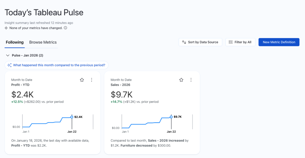
That’s why Tableau introduced Tableau Pulse. Rather than a large and complex dashboard, Pulse is distilled down to single metrics that can show trends over time. These metrics are optimized for mobile-first experience, delivering personalized insights directly to a user’s workflow.
This isn’t just about a cleaner interface. It is a fundamental shift from what’s called “pull” to “push” analytics. In the past, being data-driven meant a user had to remember to log in and go on a scavenger hunt through various tabs, forcing the dashboard to try to pull users to their insights.
With Pulse, the insights come to where the work is actually happening. Whether through email digests or direct notifications in Slack and Microsoft Teams, it moves the technology from a destination you visit to a partner that keeps you informed in real time. The analytics is pushed out to your users on a daily basis.
Solving the governance gap
One of the common critiques of aging BI platforms is the mess of ungoverned data. In older environments, three different people could have built three different sales dashboards, all showing different numbers for the same metrics. Oftentimes, they aren’t even aware these other reports conflict with each other because of this lack of governance. Tableau Pulse was introduced to create what is called a “metric layer.”
In the metric layer, the logic for a metric is defined once, such as Gross Margin or Total Revenue, and that metric definition is consistent across all user’s experiences. These metrics can be shared and followed by any user (with the proper permissions), allowing for these metrics to be universal across your organization. This develops a single source of truth across companies, and removes redundancies in reporting.
Mobile insights & subscriptions first
Tableau has always been the leader when it comes to mobile dashboard design. Few tools allow for users to optimize both mobile and desktop layouts on the same dashboard. Still, this process required Tableau developers to pre-design both versions of the same dashboard for both screen settings.
Tableau Pulse, however, is pre-designed for both mobile and desktop with no additional formatting required. Pulse is visible as an application on smartphones, meaning users can start their day by opening up their metrics to get a pulse on what’s been happening. Even if users aren’t checking their metrics daily, once a user follows a metric, any sudden changes will be flagged and sent as an email or notification. This pushes users directly to the data and ensures that stakeholders stay up to date, driving data-centered decision making without the manual effort.
Enhancing Pulse with Enhanced Q&A
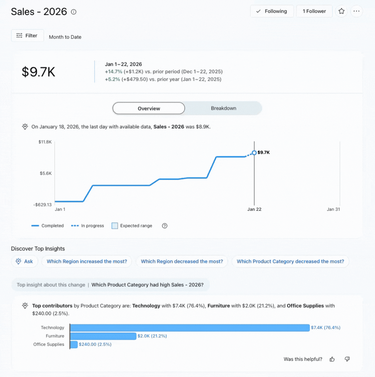
Pulse is a rockstar at metric tracking, but what else can it do? The real shift comes with the integration of Enhanced Q&A. While previous versions of natural language querying feel rigid, Enhanced Q&A allows for users to interact directly with their data using natural language. This feature is Tableau stepping out from its role as best-in-class analytics reporting toward the world of agentic insights.
Standard dashboards are great to show what has already happened, like your user base increasing by 10%, or sales dropping quarter-over-quarter. Pulse Enhanced Q&A moves it toward answering the question “Why did this happen?” If a metric you’ve defined suddenly drops, a user can immediately jump in and ask questions such as “What drove the decrease in sales last week?” or “What products experienced a drop in sales last week?” Enhanced Q&A will respond with a summarized explanation of the underlying drivers of the change. It transforms Tableau from a visual library into a conversational partner. This actionability means that your non-technical users no longer have to wait on analytics to be developed, and can get insights in the moment.
Modernize your analytics stack with Tableau Pulse
Tableau may be a seasoned technology, but it’s far from out of date. By moving from the one-size-fits-all dashboard and toward personalized, AI-driven experiences found in Pulse, Tableau has redefined how it runs analytics. For organizations looking to cut through the noise of report overload, Tableau Pulse is the answer to simplify and modernize your analytics stack. Don’t just build reports—build actions with Tableau Pulse.