

Stat-isfaction: Making Models Actionable in Tableau
Raise your hand if you can understand and explain what a t-test is and why it matters when looking at a statistical output. Keep it raised if you can do the same for MCC, F1, Sensitivity, p-values, standard deviations, etc. If you kept your hand raised that whole time without skipping a beat, hats off to you. Now raise your hand if your dashboard end-user can do the same.
Nothing against our fellow salespeople, account managers, and leadership teams. We love you, and I’m in the same boat. But these types of concepts often lead to blank stares and unused dashboards that took 3 months to build.
Oftentimes, this is where statistical analyses fail. Data scientists build phenomenal models with great accuracy, analysts build dashboards to communicate what the data scientists built, and end users are left scratching their heads, wondering what it means for their day-to-day. How does it change the way they interact with opportunities, clients, or product usage? If models are built without direct ties to the action that should be taken, adoption will be minimal at best.
One of the problems is that a data scientist’s goal is model accuracy. End users, however, assume accuracy. They need model usability.
This blog will walk through an example of a data science “accuracy” focused dashboard and how you might redesign it for a “usability” focused dashboard.
The “accuracy” dashboard: where good models go to die
Let’s start with the data science “accuracy” focused dashboard. The examples we will look at in this post are focused on customer churn for a bank. The objective is to identify customers at risk of churn, the reasons for the churn risk, and most importantly, what to do to reduce the likelihood of churn.
You may not see a dashboard exactly like the example below out in the wild. It’s a bit of a combination of different statistical dashboards we’ve seen, so it combines a few common mistakes into one. Regardless, let’s evaluate it and see what sticks out.
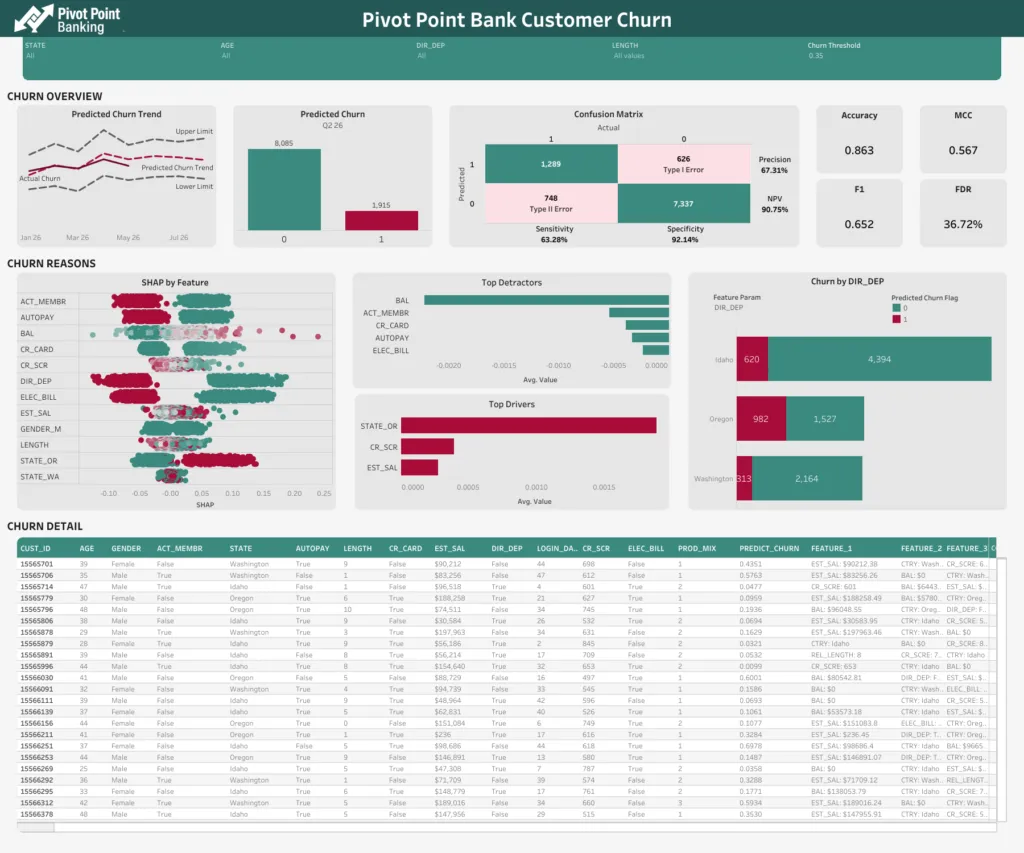
First, some kudos. This dashboard has already made its way past the “table purgatory” that many dashboards never escape. Oftentimes, dashboards are really mashups of 5 different spreadsheet-like tables that lead users nowhere. Steps to get out of that are a story for another time.
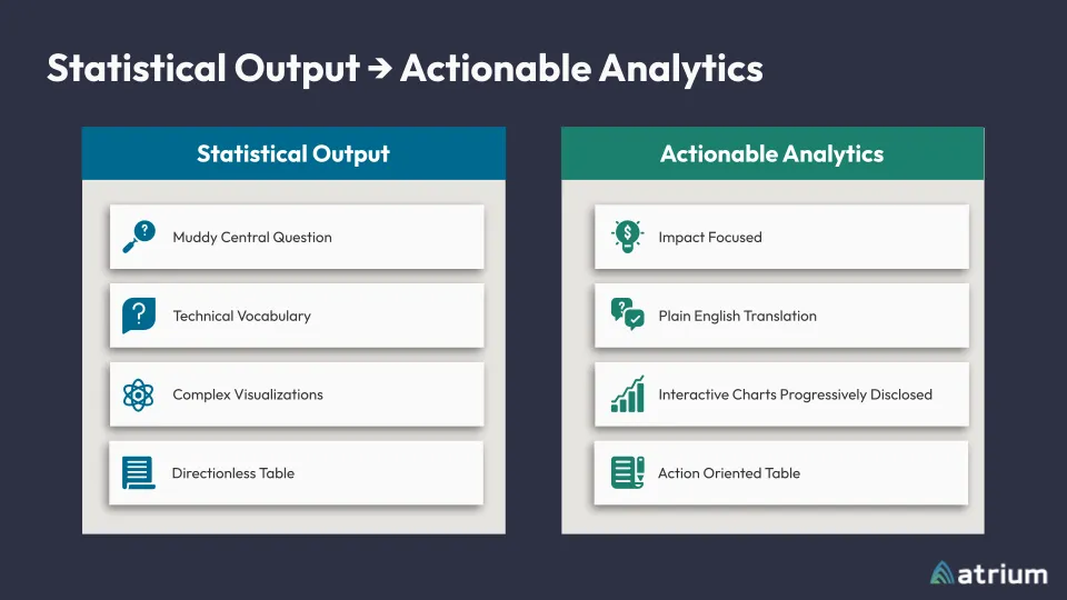
Four pitfalls that kill dashboard adoption
Here are a few things that stick out to me:
1. Muddy central question
The most important question, “Will the customer churn?”, is clouded behind a “0” and “1” label. It’s easy enough to look at this and assume 1 means “will churn,” but as you’ll see when we keep going, this is just another step for cognitive overload to take place. Users have to translate 0’s and 1’s into real meaning. And oh! If I move the Churn Threshold parameter at the top, I change the number that is churning. I might as well move that all the way to the right, and no one churns. That makes my job easy.
2. Technical vocabulary
This dashboard is chock-full of technical vocabulary. MCC, F1, Sensitivity, and other statistics vocabulary sounds important, but what do I do about it? Additionally, feature names are shrouded in mystery: CR_SCR, LENGTH, ACT_MEM, ELEC_BILL. Again, sure, maybe it’s easy enough to guess that ACT_MEM means “Is Active Member,” but the end user has to translate that along with the other 12 features and the meaning of 0 vs 1.
3. Complex visualizations
Adding another layer to this cocktail of confusion, we see a complex visualization (luckily just one or two). In the SHAP by Feature chart, I need to understand what a feature is, what each feature name means, translate whatever a SHAP score is, and figure out what type of impact having dots strictly on one side vs mixed throughout means. Not to mention that the dots are just one big glob. If you want to understand something deeper, good luck trying to find the same dot twice.
4. Directionless table
The last item I’ll bring up here is the directionless table. My favorite analogy here is the “Needle in a Haystack.” Do I care most about row 3, row 1945, or row 7299? I don’t know. I guess I just start at the top and hope it works. Let’s see, Customer 155565701 has a Length of 9… something. FALSE DIR_DEP, a LOGIN_DAYS of 44, PROD_MIX of 1, and a PREDICT_CHURN of .4351. Is that good? I guess it’s closer to 0 than not. It says some features that I have to translate, and then says PRES_1: DIR_DEP: TRUE. Clear as mud. On to the next one.
Accuracy vs. action: reframing the goal
Even a relatively good-looking dashboard doesn’t automatically translate to a dashboard that end users care about. We said earlier that a data scientist’s mind naturally leans toward model accuracy. Analysts and users, however, naturally lean toward action. Let’s talk about some relatively simple changes you can make to transition from just reporting model accuracy to actioning off model usability.
But WAIT! Isn’t it important to share the model’s accuracy? What about all of the work that went into building the model? You’re not wrong. Presenting model accuracy is still important. But the way to go about it requires translation into regular language through regular handshakes between data scientists and analysts. Here’s an example.
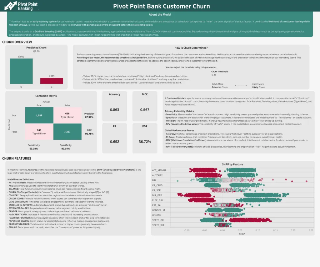
This isn’t a perfect data definition page, but notice some of the key changes that were made, and feel free to adjust this based on your audience.
- The user is given a clear and concise description of why the model was built and what it is used for.
- The threshold parameter was moved to this page. This provides some protection and reason for the default so that users can know why it’s set to what it is set at, as well as what shifts in the threshold might mean.
- All of the “data science talk” is still present, but with descriptions as to what they mean so that anyone can understand how to use the model.
Now back to the updated dashboard.
The fix: four shifts toward usability
Here are the things we did to address some of the common pitfalls we discussed earlier.
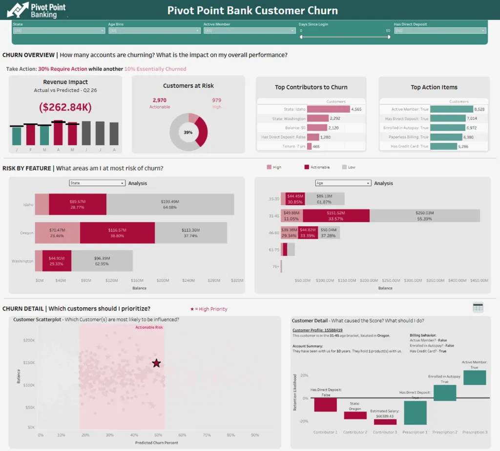
1. Impact Focused
This dashboard is immediately impact-focused. First, we aren’t stuck just having counts of customers that are churning or not churning. We start from the top with a percentage of impact and the revenue impact of the churn. Based on customer revenue, balance, sales, whatever makes sense for your model and business, you’re more likely to get attention on the dashboard if you can tie it to the bottom line.
Additionally, we’re bucketing churn likelihood. Is a customer with a churn likelihood of 90% really going to stay due to a promotion? Probably not. Would a customer with a churn likelihood of 58% reconsider? That’s more likely. We’ve got a bucket for “High” likelihood who have probably already decided to churn, a bucket for “Actionable” likelihood, and a bucket for “Low” likelihood. My eyes are drawn to the darker “Actionable” segment everywhere, so now I want to figure out what to do with those customers.
2. Plain english translation
Feature names now make sense in natural language. DIR_DEP now means “Has Direct Deposit.” LENGTH now means “Tenure: 7 yrs.” The bottom (which we’ll get to in a minute) makes it clear what the top contributors to the score are, along with some things I can try to do to reverse the churn likelihood. No translation required. Just read it like you would a slide deck.
3. Interactive charts with progressive disclosure
The user is guided through the haystack to the needle(s) via parameters, dashboard actions, and a natural flow as they move down the dashboard. The stacked bar charts allow the user to choose the breakdowns they care about the most, identify correlations (not causation) between them, and easily identify the high-priority marks in a scatterplot. Further, by clicking on a point, they can be given all sorts of information about the mark. This example just shows a waterfall, but it could be a full card with the mark’s information.
Crucially, notice how the waterfall contains recommendations to reduce churn. This furthers the real actionability of the dashboard by giving the user suggestions for what to do. Rather than guessing, we can guide users to the next steps. In this case, we’re using Prescriptions from Data 360’s Model Builder, but you can use Snowflake AI functions or hook the model up to your LLM of choice to get recommendations based on model scores!
4. Action-oriented table
Lastly, that detail table is still available, with a couple of enhancements. First, it’s hidden. We’re trying to familiarize users with the ability to be led to the needle by making the initial path a scatterplot. Then, the detail table contains visuals that make it easier to find the points that make the most sense. Want to see which account has a higher balance? It’s just a glance rather than reading a full table. Want to see which account has a higher risk? Colors cue me in before I can finish the question.
From statistical output to stat-isfaction
With a few simple adjustments, you can transition from merely reporting model accuracy to creating reports that highlight what to do about a model’s output. When analysts and data scientists partner to translate statistical complexity into plain-language, action-oriented dashboards, they move end-users from being overwhelmed by technical vocabulary to feeling ‘stat-isfied’ and empowered to take meaningful action.
By focusing on guiding users to the most impactful actions and providing clear next steps, you ensure that your investment in data science leads to real business value and drives the change you seek.