ThoughtSpot & the Eras Tour: A Data Mastermind
While Taylor Swift’s Eras Tour may be long over, the impact felt is still high and far-reaching. For today’s article, we’ll be exploring the tour’s massive footprint through ThoughtSpot.
ThoughtSpot has the unique capability of allowing users to Shake It Off when it comes to traditional, rigid reporting, and instead dive deeper into any visual they see on screen. With the help of our AI assistant, Spotter, we can find the Invisible String connecting attendance, revenue, and song choices.
The invisible string: the data model
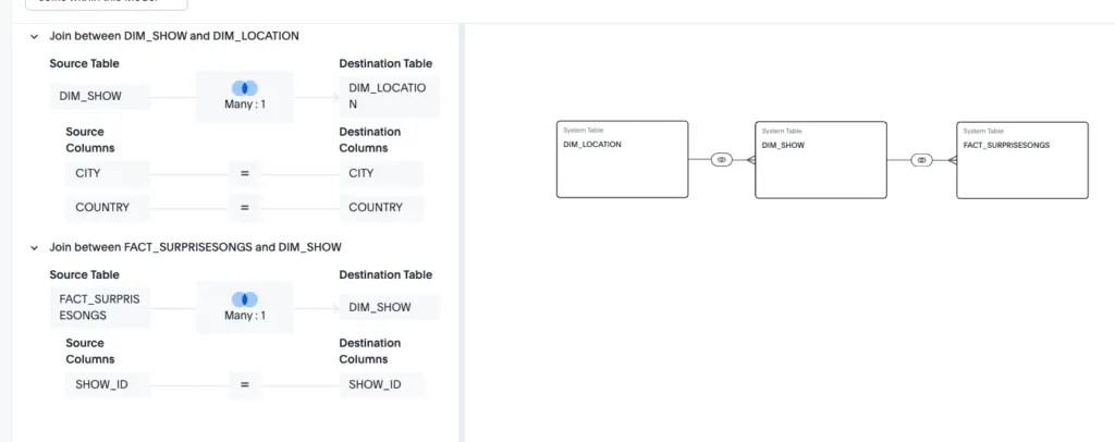
For this analysis, we have three data tables that we’ll pull into our data model. In ThoughtSpot, a data model is our “Invisible String” that will power all the features of the liveboard, Spotter, and beyond. The tables below will be joined together to develop the model:
- DIM_Show: Highlights the individual shows, including location, estimated attendance and ticket gross, and venue name.
- DIM_Location: Provides geographic information about the locations where the show took place, including latitude and longitude, continents, and venue capacity.
- FACT_SurpriseSongs: A breakdown of all the surprise songs that Taylor performed on the tour, and whether they were mashed up with another song.
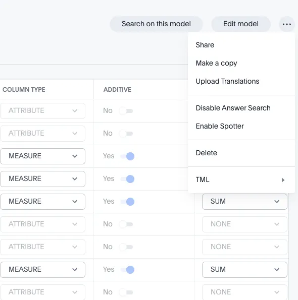
Using ThoughtSpot, we’ll make a model that combines all this data together into a single table. Once I’ve established my Snowflake connection, I’m able to pull the tables I need and establish joins between the tables. This allows me to define the relationships my data model will use, and reference the different tables across my liveboard views.
… Ready for it? The liveboard
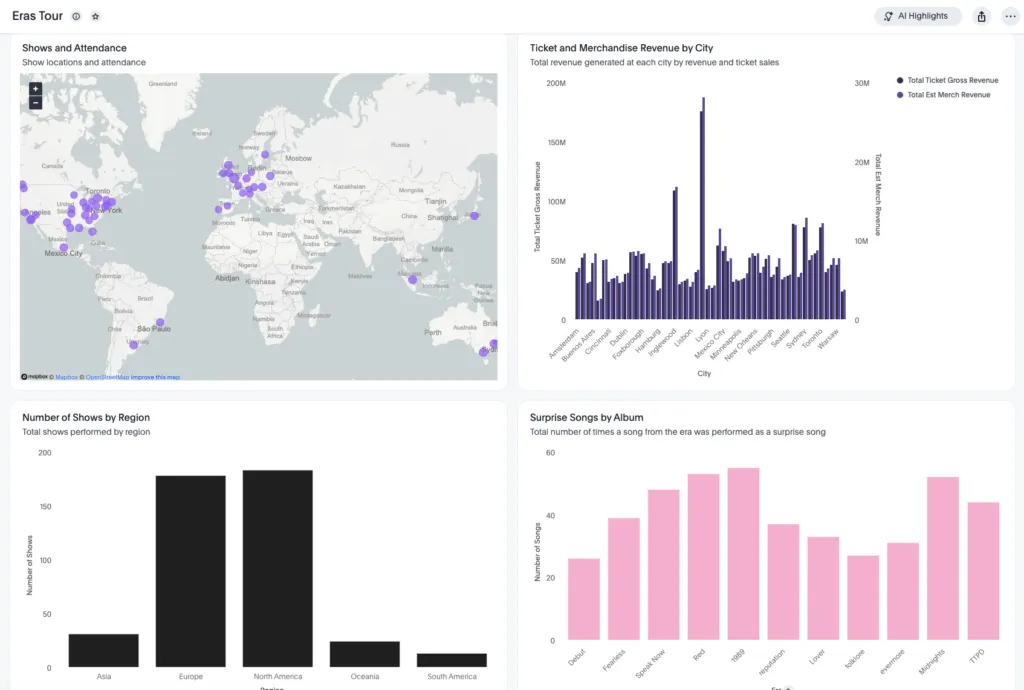
For the liveboard, what we call the traditional dashboard in ThoughtSpot, I want to highlight some of the key features of the Eras tour. First, where the shows were, and how much attendance each show had, and how much money each show made. Then, we’ll want to dive into what Taylor actually performed, by exploring which Eras had the most surprise songs and mashups.
Developing the liveboard in ThoughtSpot isn’t like other BI tools. Instead of your traditional drag-and-drop functionality, you can simply ask ThoughtSpot to make the visuals you’re looking to create, and pin them to a liveboard. I’ll start by navigating to the Insights tab in ThoughtSpot and clicking the plus button, before selecting “New Liveboard.”
Now, let’s go back to the homepage, and find the same place you created the new liveboard. Instead, we’ll create a new answer. I want to create a visual of attendance by city. Instead of selecting those features, I can simply type into the search bar: “ Attendance by City.” ThoughtSpot automatically recognizes this and builds my visual.
The output is a bar chart, but I can easily swap this for a map or bar chart. See below for the visual we were able to create:
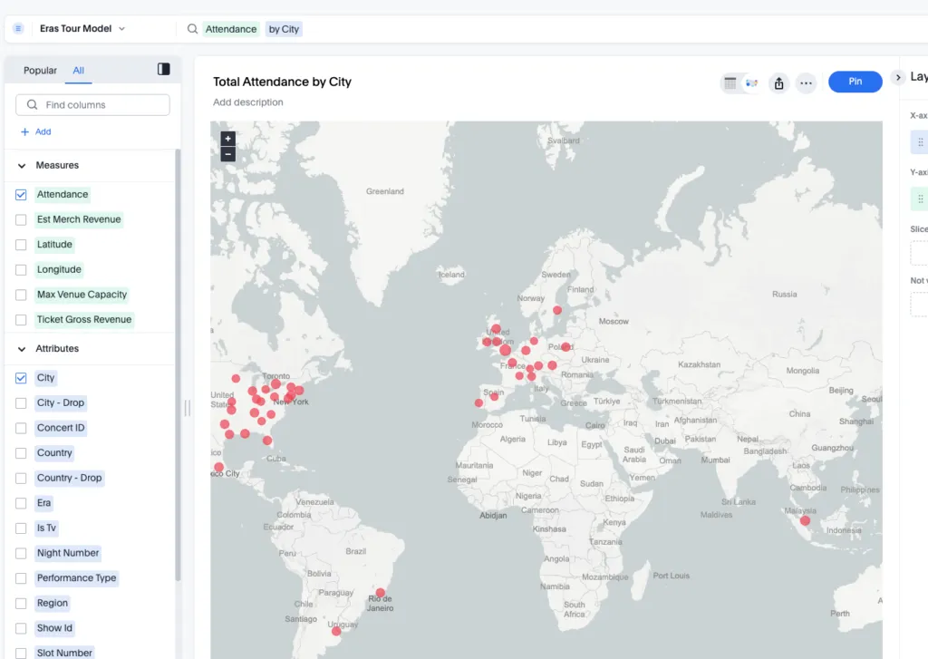
From here, we can “pin” this image to our liveboard as our first visual. Now we can add more visuals, such as the total estimated revenue, and merchandise revenue by city, and total number of shows per region. Using the same approach of creating an answer, used the following statement to build the first visual:
Gross Revenue Merch Revenue by City
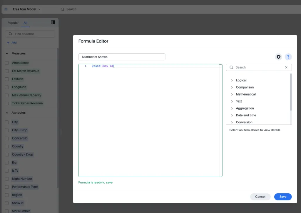
For the second visual, we’ll need a formula. We need a formula to count the number of shows. Click the “ + Add” button and you’ll see a popup for the formula editor. Here I can add the count(Show Id) formula to count the number of shows at each location.
Now I’ll type “Number of Shows by Region” to build my visual, and pin it to the liveboard.
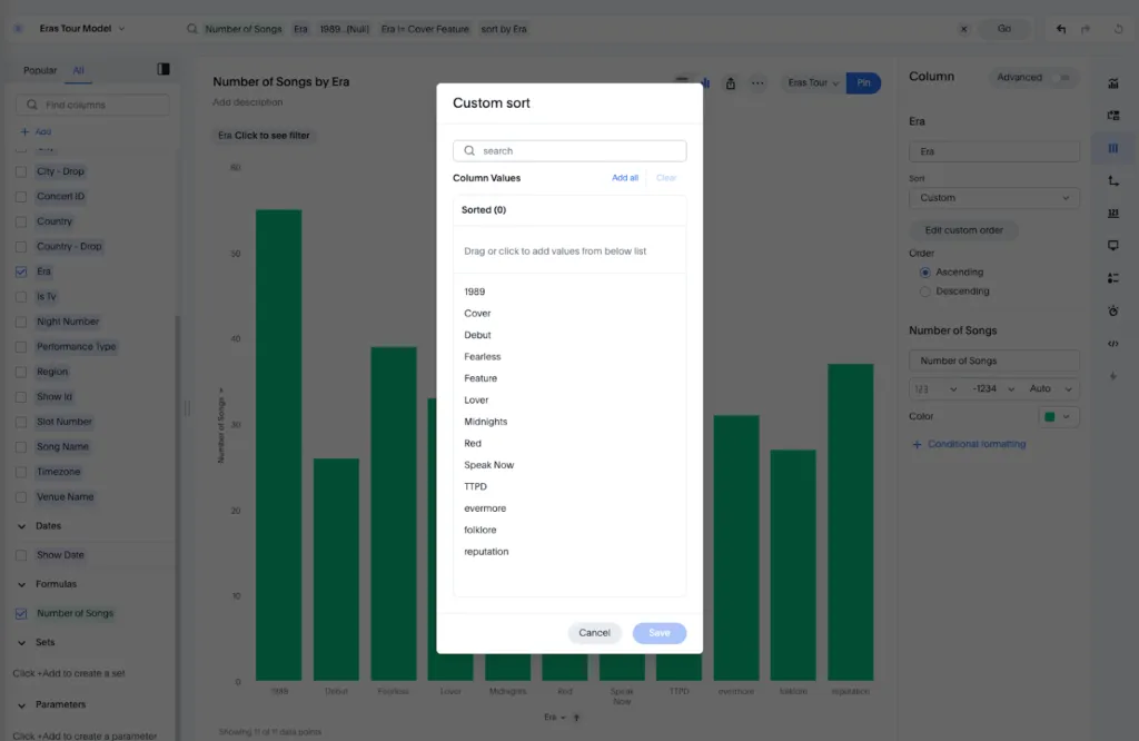
For our final visual, we’ll be identifying the number of surprise songs for each visual. We will need another formula for Number of Songs, similar to how we developed the previous formula. (Keep in mind, the formulas we create here will only appear in the current answer; to add a formula to a data model, we’ll have to do that at the model level.)
Once we’ve done that, we see that Taylor performed some covers and features on the tour, when we just wanted to include the Eras themselves. We can modify our visual by finding “Era” in the left-side panel and excluding Cover and Feature from our visual.
You can even set a custom order to ensure the visual is presenting the albums in the right order. This can be found on the right side by selecting the column visual.
Now we can pin this to our liveboard, and view our final dashboard.
Feel free to play around with the visuals to ensure the formatting and style are as close to the Eras tour as you can make it!
The mastermind: Spotter
The key feature of ThoughtSpot that makes it unique across all BI tools is its ability to use natural language directly on top of the data models you’ve created with little to no training. No more “Death By A Thousand Cuts” via complex SQL queries and calculations.
In order to turn this model into a Spotter-powered model, we’ll need to find our Data Model in the data workspace of the homepage, and click on your model. Once you’ve done that, you can “Enable Spotter.”
Now that we have Spotter configured, let’s put it to the test. You can access Spotter by navigating to your liveboard and hovering over the visual that you are interested in exploring and look for the Spotter visual. This will create a popup where you can interact directly with the data source, asking natural language.
I’m interested in Taylor’s surprise songs. I want to know when Taylor performed my favorite song, “Guilty as Sin,” on the Eras Tour. I’ll open up Spotter on the Surprise Songs visual and type in my question.
“Where was Guilty as Sin performed?”
Once Spotter completes, it provides me with a list of the cities where the song was performed. This was all done with no training of any kind, which is pretty great.
But let’s say I want to train the model so the visuals provide a better story when a user asks a question. You’ll then see a button on the bottom called “Add to Coaching.” This is how you can train Spotter to know how to answer similar questions and output visuals. Once I click Add to Coaching, ThoughtSpot will provide a suggested visual for the question. I like the visual, so I’ll click save. Now if someone asks a similar question like “Where was ‘Teardrops On My Guitar’ performed?” a similar visual will load up.
Let’s try a harder question. On the tour, Taylor started performing mashups to two songs at the same time. I want to know which Eras were more likely to be mashed up together as the surprise song.
What eras were most likely to be mashed up?
While ThoughtSpot analyzes this, it will explain its logic, calling out what filters, and steps it’s taking to answer the question. After it’s finished, it’ll show you the most likely Eras to be mashed up and key insights that explain why the data found what it did, calling out reasons like The Tortured Poets Department being mashed up the most because it was the most recent album released.
And all of this was done with little to no knowledge transfer or training to the data model powering Spotter.
ThoughtSpot is a unique BI tool in the market
With our Eras tour example, you see just how easy it is to go from three tables of data to a completely designed and optimized liveboard with natural language search enabled. Even with minimal training, the model was able to output accurate and complete answers to complex questions, just like that. With ThoughtSpot, your data strategy is finally Out of the Woods.