Why Sigma is the Spreadsheet you Already Know (But Better)
The most common business intelligence tool across all organizations is Excel. Spreadsheets dominate business intelligence, from finance to customer service. Even in organizations where BI tools exist, one of my least favorite questions that I’m often asked as a consultant is “How do I export this to Excel?”
Many BI tools have tried to tackle this Excel question in a variety of different ways. This includes developing flows and logic to directly interact with the source data, or inclusion of filters and parameters that can be modified to develop formulas and make changes.
However, no matter how many changes people make to their dashboard, there are still going to be users who are asking to export these tables. Most tools force a choice: you can have governed, pretty charts, or you can have flexible, messy spreadsheets.
Sigma is the first tool that refuses to require users to make a choice.
A hybrid approach: spreadsheets designed for dashboards
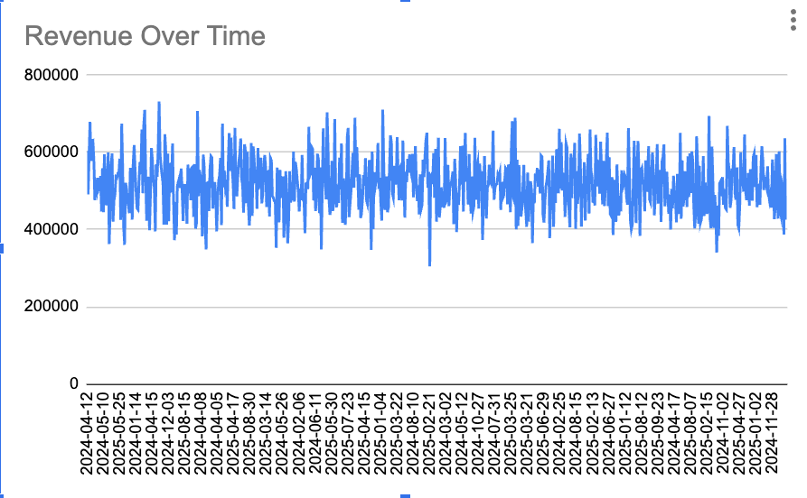
In Sigma, users aren’t asked to forget about their all-too-familiar spreadsheets, but instead interact with them directly within a dashboard. One thing that Excel was never very good at was developing dashboards and charts.
Historically, Excel was never built for modern dashboarding. It struggles with version control, visualization scaling, and lagging when too many people try to edit a file at once.
Sigma takes the spreadsheet model and elevates it to a professional BI standard.
- The Formula Bar: The direct interaction with data through formulas and inline edits are what make Excel so attractive. That is not lost in Sigma. If you can write an
IFstatement or aVLOOKUPin Excel, you can build new fields and formulas in Sigma. - Powerful Querying: You can display, pivot, and manipulate millions of rows of data instantly without your computer fan sounding like a jet engine.
- Visual-First Exploration: In Sigma, the spreadsheet is the starting point for the chart. You can highlight a range of cells and turn them into a bar chart or a map in two clicks, keeping the “raw data” and the “visual” side-by-side.
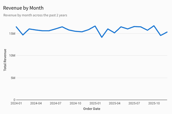
In the spreadsheet tool, you have to develop additional formulas in order to get the visual you want to create; for example, grouping your visual by month. In Sigma, all you have to do is plug your data into a chart visual and you have a fully realized monthly revenue visual.
Ending the export-to-Excel nightmare
We can talk about visualizations all day long, but that doesn’t get to the main problem with the “Export to Excel” formula. The main problem is that the data is stale from the moment the user presses that Export button. If you’ve designed a dashboard that encourages (one way or another) a user to pull the data out of the analytics tool, and into Excel, you’re unintentionally creating hundreds of different copies of the same data. This practice prevents your organization from being a governed, secure data environment, and turns it into the Data Wild West!
If your workflow encourages users to pull data out of a secure analytics tool and into a local .xlsx file, you are unintentionally creating a Data Wild West.
- Conflicting Truths: One manager is looking at a file from Monday; another is looking at a file from two weeks ago. Both are drawing their own conclusions from these different data sources.
- Manual Labor: Hours are wasted every week “refreshing” reports manually when they should be automated. Users create reports that meet their needs, which require constant updating, leading to manual labor and potential human error.
- Broken Governance: Once data is exported, you lose the ability to track who sees what. All permissions, row-level security, and visibility disappears.
Even though you might have advanced BI solutions and technologies, you’re not truly a data-driven organization. If your business is making decisions based on stale data, you’re a gut-driven organization. This is why Sigma’s warehouse-native architecture is a game changer. Sigma doesn’t just “connect” to your data; it lives on top of it.
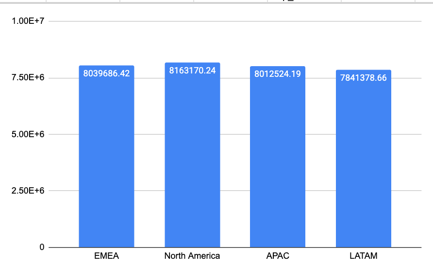
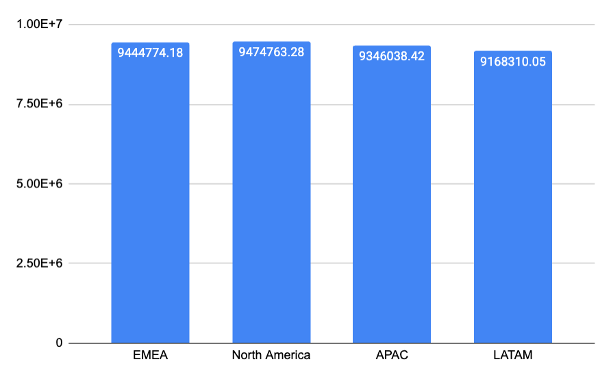
Notice how the two bar charts created from exporting from the same dashboard produce very different information. The bar charts show Profit by Region, exported two weeks apart. You can see how the chart exported two weeks ago is nearly $2 million below the chart to the right in each region. In that time, much of the business could have changed!
Warehouse-native: the live connection
This is why Sigma’s warehouse-native architecture is a game-changer. As I said, Sigma doesn’t just connect to your data, it lives on top of it. So when you perform an action in Sigma, Sigma translates that “spreadsheet action” into SQL and sends it directly to your cloud warehouse (like Snowflake, Databricks, or BigQuery). If you apply a filter, add a column, or create a formula, you’re modifying the live data, not a copy of the data extracted earlier. This removes the need to export data, to make adjustments or changes, and prevents the Data Wild West from forming.
You’re probably wondering: how does Sigma perform with large data sources? How can it possibly run live connections across million row data sources and still have a performant dashboard? Sigma brands itself as a “warehouse-native” BI tool because there aren’t any intermediate steps between warehouse and visual. There is no million-row limit on data, or minutes-long export times like you’d run into with excel. It’s a live, performant data connection.

Don’t fight the spreadsheet anymore
For too long, the goal of BI was to get users out of the spreadsheet. Get users out of Excel. Sigma as a BI solution proves that users don’t need to fight the spreadsheet anymore. Sigma’s goal is instead to make the spreadsheet secure, scalable, and live.
When I implement Sigma at different organizations, customers no longer ask to export to a spreadsheet, because Sigma is the spreadsheet. And it’s not just a spreadsheet—it’s a fully realized BI tool with advanced visuals, charts, and KPIs. It just happens to be built on a spreadsheet that users can create, edit, and modify.