From Chaos to Order: A March Madness Tableau Retrospective
Salesforce supports several powerful tools for visualizing data in Tableau CRM (formerly Einstein Analytics) and Tableau Desktop. While both tools can be used to surface insights from CRM data, they can do far more. With March Madness wrapping up, I took some time to explore NCAA basketball data using Tableau, and to show how it can be used to identify trends and measure new metrics of team performance. This blog post outlines my analysis and details some interesting insights surrounding Final Four teams. The data comes from Kaggle’s March Madness Machine Learning Competition and its associated datasets.
March Madness: A Cornucopia of Data
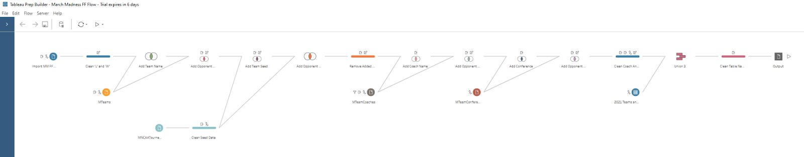
My first step was to ensure the data I downloaded was orderly and clean before bringing it into Tableau Desktop. Luckily, Tableau has a great data wrangling tool in Tableau Prep Builder that makes joining, transforming, and cleaning data a breeze. I was able to quickly connect each of the individual tables together, remove any duplicate records, and generate a single CSV dataset that was ready to be digested by Tableau Desktop. The screenshot below shows what this step looked like in Tableau Prep.
Using Tableau to Create and Visualize Team Hardship
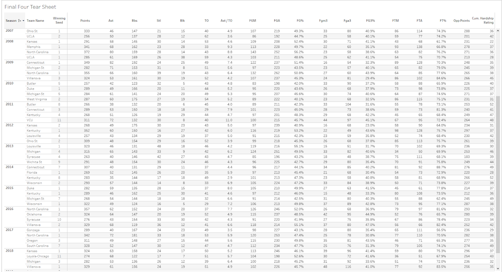
After loading the data into Tableau Desktop, I decided to start with something easy, and created a simple table view that summarized the tournament performance of every Final Four team going back to 2003 (the first year with complete team data). When adding basketball’s classic statistics (points, assists, rebounds, etc.) to the table, I had an idea for a new statistic that captured the strength of the opponents each team had faced on the road to the Final Four. I knew there was an “Opponent Seed” field in the dataset, and that I could create a value that summed all of the seeds that a Final Four team had faced.
However, I realized this would create a kind of inverse metric where a lower value would indicate a more difficult path to the Final Four (assuming that facing lower seeds is more difficult). So, instead of simply summing the opponent seeds, I designed the calculated field to sum 17 minus the opponent seeds. This new metric, which I call “Hardship Rating,” would increase if a team faced lower seeds on the way to the Final Four, and vice versa.
For example, if a one seed played a 16 seed, an 8 seed, a 5 seed, and a 3 seed on the way to the Final Four, their hardship rating would be calculated as 1 + 9 + 12 + 14 = 36. After making this change, I added it as the last column in the data table, which can be seen below.
At this point, the idea behind hardship rating still intrigued me, and I wanted to explore it further. I was curious to see if a Final Four team’s hardship rating was linked to winning the championship. I decided to make a graphical visualization to showcase this relationship, which resulted in the following plot.
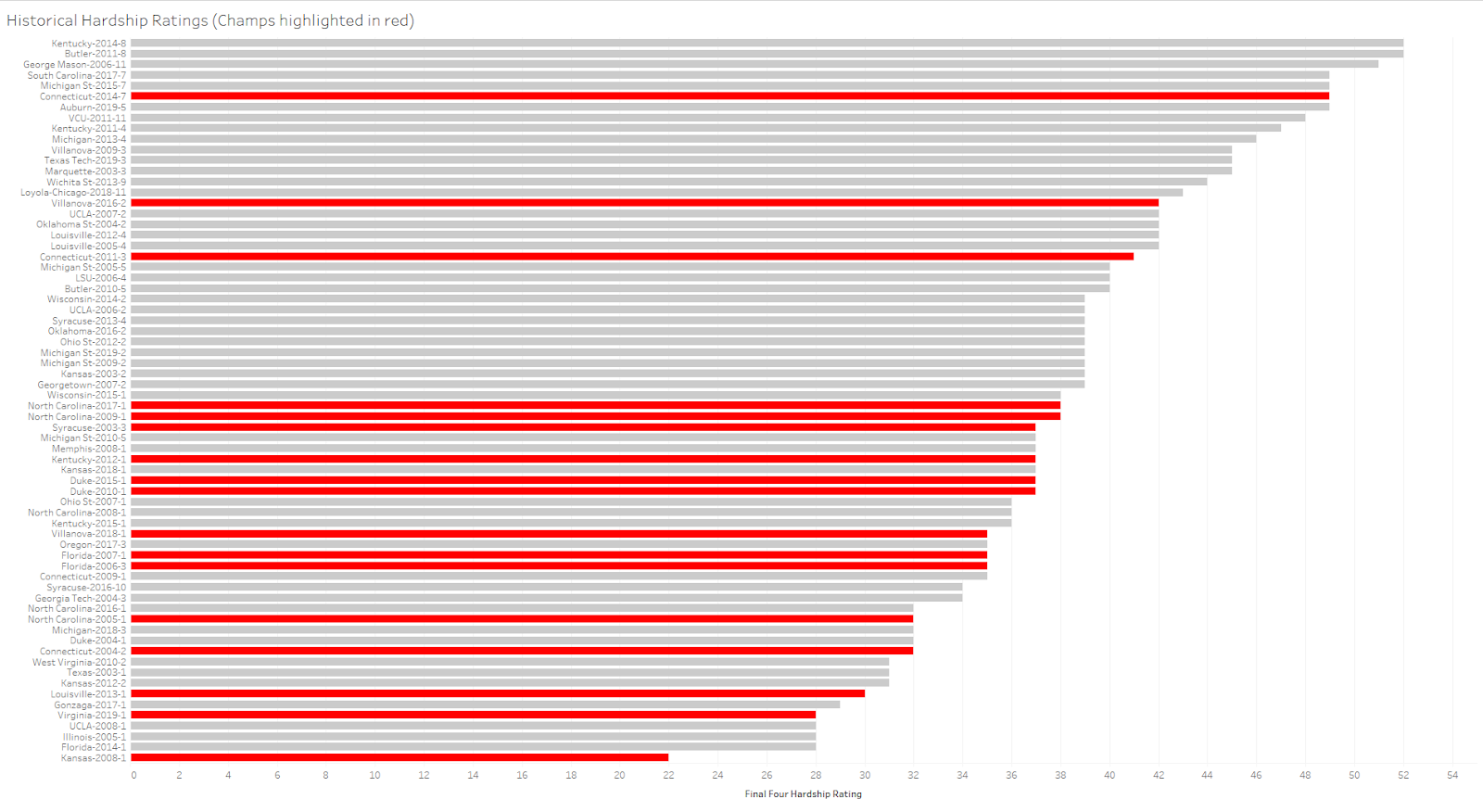
When I first looked at the historical hardship ratings graph, I realized an inherent bias in the data. Lower seeds always play a supposedly weaker higher seed opponent in the first round, which prevents them from ever scoring high on the hardship rating metric.
For example, the hardest hypothetical path to the Final Four for a one seed would be to face a 16 seed in the round of 64, an 8 seed in the round of 32, a 4 seed in the Sweet Sixteen, and a 2 seed in the Elite Eight. Thus, the highest possible hardship rating for a one seed is 38 (1+9+13+15). Of course, the opposite is true for higher seeds, who are forced to play more difficult lower seed opponents in round one (to see a plot of the minimum and maximum hardship ratings for each seed, click here.)
Hardship: A Problem in College Basketball, and in Sales
Nonetheless, even with these patterns baked into the data, the above graph still tells some interesting stories. For instance, the highest cluster of national champions (denoted by the bars highlighted in red) appears to be centered around the middle of the hardship rating distribution (9 out of the 17 champions since 2003 had hardship ratings between 35 and 38).
One reason for this phenomena could be that teams with low hardship ratings weren’t “battle tested” enough on the way to the Final Four. Another reason could be that teams with hardship ratings above this range are burnt out from playing tougher opponents prior to the Final Four. For example, in 2011, Butler had the most mathematically difficult path to the Final Four possible, as they faced a 9 seed, a 1 seed, a 4 seed, and a 2 seed on the way to the Final Four. That equates to a hardship rating of 52, which is also the theoretical maximum hardship rating for an 8 seed. After facing such difficult teams prior to the Final Four, it’s possible that they had accumulated a substantial amount of physical and mental fatigue.
One team that was able to overcome their high hardship rating was the 2014 UConn team. Despite having the 6th highest hardship rating in the dataset, the Huskies were able to knock out both the one seed Florida team in the Final Four, and the 8 seed Kentucky team in the title game to win the national championship. This suggests that the 2014 UConn team is one of the most impressive championship teams in the dataset.
Now Apply This Logic to Sales Leads
An analogy that could make digesting this graph easier could be viewing each of these hardship ratings as sales leads. High hardship ratings are your cold leads, which have a low chance of conversion (low chance of winning the national championship), while teams with low hardship ratings are your hot leads, which have a high chance of conversion (high chance of winning the national championship).
You would expect a salesperson who was given cold leads to work to make fewer sales than a salesperson given hot leads. So, if a cold lead salesperson out performs a hot lead salesperson it’s a big deal. (You can think that UConn was one of the final four teams that was given “cold leads” that still performed well.)
Visualizing Point Differentials in Tableau
The next concept I explored was point differential. I wanted to answer the question: is there a relationship between blowing teams out of the water on the way to the Final Four and winning the national championship? By subtracting a Final Four team’s points allowed from their points scored, I was able to calculate each team’s cumulative point differential (CPD), and produce the following charts.
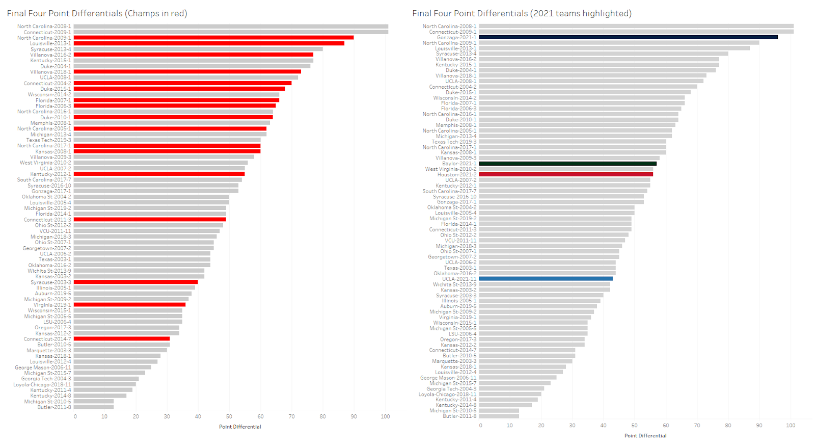
Right off the bat, by looking at the graph on the left, it’s easy to see that there appears to be a strong relationship between having a high point differential and winning the national championship. Since 2003, only four national champions had a cumulative point differential less than 60 (meaning on average they beat their pre-Final Four opponents by less than 15 points per game). Another interesting insight from the graph on the left is that again, the 2014 Connecticut team is an outlier. Despite having an extremely difficult path to the Final Four (they have the sixth highest hardship rating in the dataset), and despite barely beating their opponents (their average margin of victory per game was 7.75), they were still able to rally and win the championship.
The graph on the right highlights this year’s Final Four teams instead of highlighting previous champions. One can easily see that Baylor and Houston were around the aforementioned 60 point threshold (with point differentials of 57 and 56 respectively). Gonzaga was far above this mark with a CPD of a whopping 96 points (winning on average by 24 points a game), and UCLA was far below this mark with a CPD of 43. Given that Houston and Baylor had essentially the same CPD, and that Gonzaga’s CPD was more than twice UCLA’s, a reasonable observer could have predicted that the Baylor vs. Houston matchup would go down to the wire, and that the Gonzaga vs. UCLA matchup would be a blowout.
However, the opposite happened. In the first game, Baylor quickly jumped out to an 11 point advantage within the first 10 minutes, and held on to that lead for the rest of the game. The second game, which was supposed to be a blowout, turned out to be an overtime instant classic that will surely go down as one of the greatest Final Four games of all time. I guess they call the tournament March Madness for a reason.
Visualizing Winning Team Colors: Once in a Blue Moon?
The last concept I wanted to investigate was if there was a pattern of what team colors won the national championship. This might sound unorthodox at first, but college basketball fans frequently talk about “Blue Blood” teams (typically this bucket includes UNC, Duke, Kansas, and Kentucky). I wanted to see if the nickname lived up to the hype. I linked every national champion to the first color that popped up on teamcolorcodes.com, created a quick and simple bar chart, and what I discovered next was both shocking and fascinating.
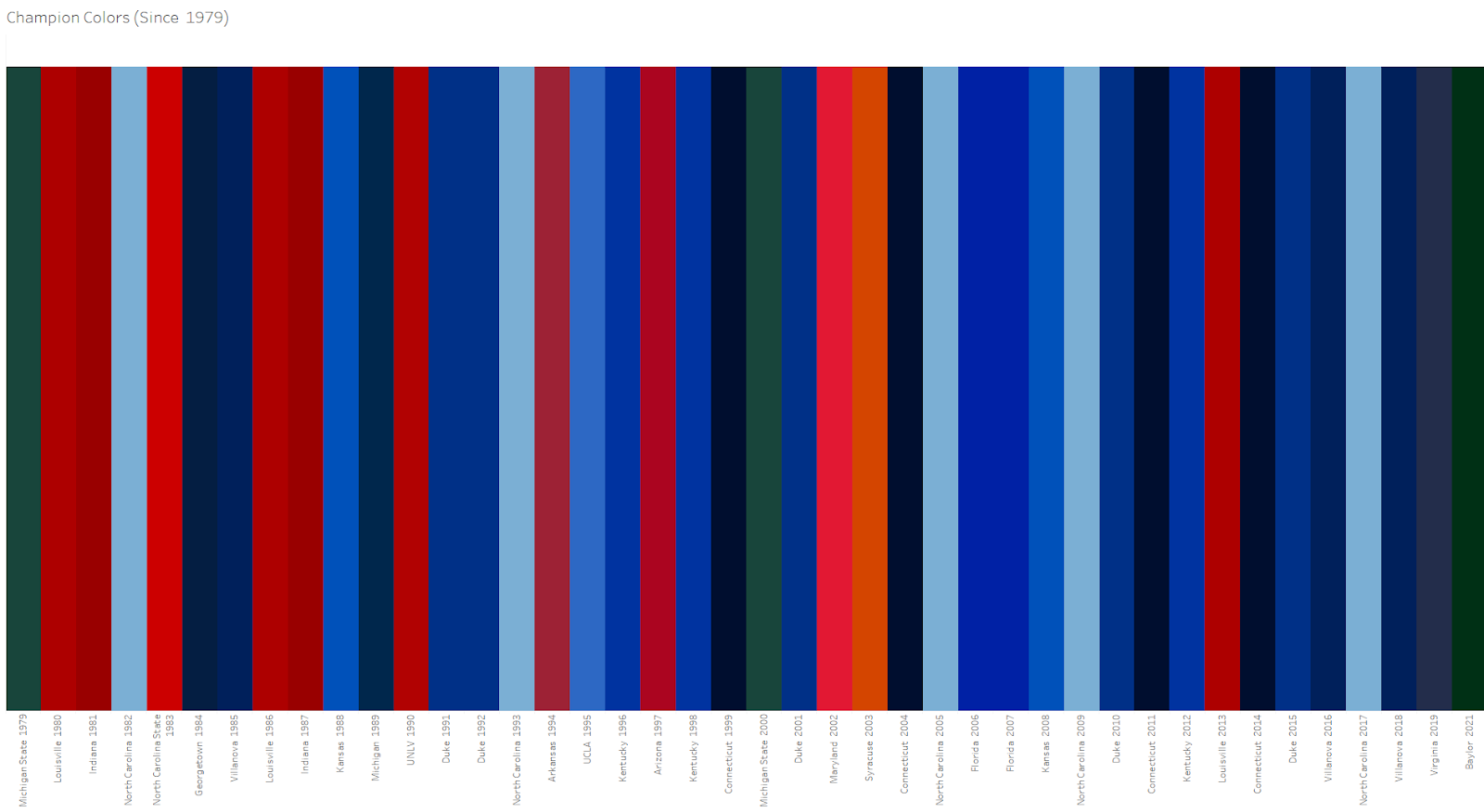
The first thing I noticed when looking at this visualization is just how blue it is! Going back to 1979, blue teams have dominated the tournament, winning 67% (28/42) of the time. Red is the next most successful color, winning 24% (10/42) of the time. Green and orange round out the winning colors with four wins together.
Now you might be wondering, Matt, why did you label Virginia as blue? Isn’t orange also one of its primary colors? To answer that, I’d point you to the number one rule of data analysis — start with an agenda and do whatever it takes to prove it (just kidding).
Another pattern I noticed was not just how dominant blue teams were in general, but especially how dominant they were in the last two decades. Prior to Baylor’s win in 2021, a blue team had won March Madness every year since 2003 (we can exclude Louisville’s win in 2013 as it was vacated due to recruiting violations). Gonzaga looked like it would surely continue blue’s dominance in 2021 as it ripped through the regular season without losing a game. However, Baylor was able to defeat them, and became the first non-blue team to win the championship in 17 years, and the first green team in 21 years.
Here’s Where Things Really Get Spooky
The last green team to win before Baylor was Michigan State in 2000 (21 years ago), who beat another blue team (Florida) in the finals. Going even further back, the last green team to win before Michigan State in 2000 was Michigan State in 1979, another 21-year difference. Guess who they beat in the finals?
That’s right, another blue team, Indiana State. That 1979 Indiana State team wasn’t just another college basketball team either. They were led by future hall of famer Larry Bird, and hadn’t lost a game all year until the championship (just like Gonzaga this year).
This tells me a few things. First, if I’m an undefeated blue basketball team, I want to stay as far away from green teams as possible. Second, the next green team to win the title will be in another 21 years in 2042 (sorry Michigan State, Baylor, and Oregon fans). Lastly, my Indiana Hoosiers need to rebrand our crimson to navy in order to have a better shot of winning it all!
Interested in Learning More About Tableau?
All in all, this March Madness analysis project absolutely helped me grasp the strengths of Tableau. It’s a powerful tool, and when used correctly, it can generate impactful insights. All of the tables and graphs (and even a few more unmentioned ones!) discussed in this article can be viewed in more detail here.
If this article has inspired you to create your own Tableau visualizations about a topic that interests you, great! You can get some more background on Tableau’s strengths and weaknesses by reading Tyler Pollard’s “Tableau for Beginners” article and start watching Tableau’s fantastic free training videos… or start a free trial of Tableau. You will be comfortable creating your own visualizations in no time!
Want to discuss how Atrium can generate value for your business with Tableau? Let’s talk.