How to Leverage the 3 Tiers of Tableau Forecasting
Anyone who has ever analyzed a dataset using Tableau would be able to speak to its power and flexibility. One way to get even more out of the tool is by utilizing Tableau forecasting capabilities. These modeling techniques range from being as easy as dragging and dropping, to having to flesh out multiline Tableau functions/www/atrium_407/public. We will cover the three most prominent ways to forecast in Tableau in increasing levels of complexity.
Tier 1: Identify Patterns with Trend Lines
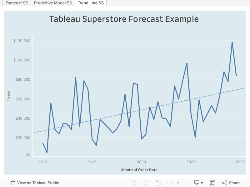
When to use: When you want to quickly visualize basic trends in your data
How to add: Within a Tableau worksheet, navigate to the analytics pane. Under the “Model” header, click and drag “Trend Lines” onto your worksheet. During this step, you will have to choose a trend line model. If that sounds intimidating – don’t worry! Tableau will only show models that are relevant to your data. Here’s more on Tableau trend line model types.
Limitations: Both the x and y axes must contain a numerical field, or a field that can be converted to a number like a date. Trend lines are not supported for multidimensional data sources and ‘m/d/yy’ and ‘mmmm yyyy’ date formats.
Other considerations: After adding a trendline to the view in your worksheet, you can hover over it with your cursor to review the model’s summary statistics. You can access additional trend line settings by right clicking on your trend line, then selecting “edit all trend lines”. This will give you access to a menu that lets you configure the trend line model type, model factors, trend line confidence intervals, and much more. You can read more about trend lines in Tableau here.
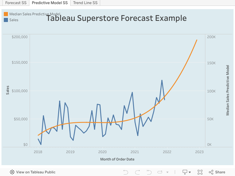
Tier 2: Predict Future Values with Forecasts
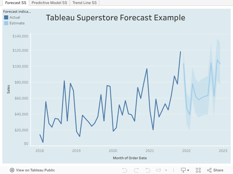
When to use: When you want to quickly forecast future values for a measure of interest.
How to add: Within a Tableau worksheet, navigate to the analytics pane. Under the “Model” header, click and drag “Forecast” into the “Add a Forecast” pane. Alternatively, you can right click into the area of your chart, then select Forecast → Show Forecast.
Limitations: You must have at least one date dimension and one measure. If you do not have a date value, Tableau can create a forecast with a dimension (that has integer values) and at least one measure.
Other considerations: Tableau will automatically select the modeling algorithm that produces the forecast with the highest quality. Two data phenomena to watch out for when selecting a forecast are data seasonality and data trends.
Data seasonality occurs when data fluctuates in a predictable and recurring pattern over a set period of time. For example, an ice cream shop’s sales might be higher in the summer than in the winter.
Data trends occur when there exists an underlying tendency for data to increase or decrease over time. If an ice cream shop increases its sales year after year, there will be an overall positive trend in the shop’s sales data. As a human looking at data points, it can be extremely difficult to identify and account for both seasonality and trends. Luckily, Tableau automatically identifies these patterns and selects the most appropriate algorithm to model them.
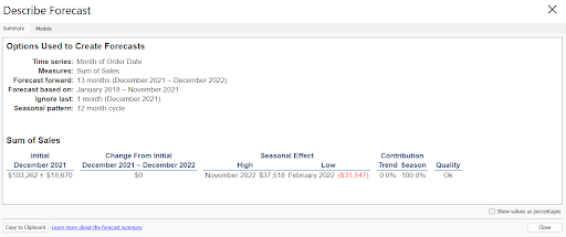
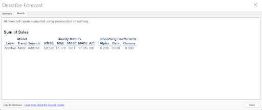
In most cases, Tableau will automatically configure the most optimal forecast settings. However, if you did want to customize your Tableau forecast, right click in your view, then select Forecast → Forecast Options. This will allow you to further configure the forecast’s length, underlying source data, the forecast’s model, and the forecast’s prediction interval. You can review a forecast model’s summary by selecting Forecast → Describe Forecast within the view. This will generate a dialog box that describes the forecast, and offers a quantitative summary of its underlying model. If you want to learn more about how forecasting works in Tableau, you can review Tableau’s “How Forecasting Works” blog post.
Tier 3: Unlock More Prediction Power with Predictive Modeling Functions
When to use: When you conduct analysis with a more complex and complicated prediction model.
How to add: Create a calculated field using the MODEL_QUANTILE OR MODEL_PERCENTILE functions.
Limitations: Requires some understanding of statistical modeling and how to create calculated fields in Tableau. Your predictors (fields that factor into the model) must be at the same or higher level of detail than what’s in the view.
Other considerations: This method of forecasting is NOT for Tableau beginners, and requires statistical knowledge to implement correctly. That being said, it provides a lot of flexibility to a user who wants to model a complex process (with multiple predictor variables). Due to the intricate nature of these functions, I highly recommend speaking with a Tableau expert before implementing them in your workbooks.
After reading through the different methods of Tableau forecasting, hopefully you have a better understanding of which level fits your needs. If you need a straightforward summary of existing data, trends lines are the best. If you want a powerful yet simple drag and drop forecasting tool, the forecast node is the most appropriate. If you want to model complex processes with multiple factors, predictive functions are the way to go. However, if you still have questions about Tableau forecasts, let us know and we’ll be glad to chat with you.