Predicting Customer Churn: 6 Steps to AI Data Modeling in Snowflake
Many companies want to take advantage of AI, machine learning (ML), and analytics to make smarter, more proactive business decisions. Predictive analytics is especially important in situations where organizations seek to get ahead of problems like customer churn.
Imagine if an organization like a bank or a software company could know beforehand that a customer was likely to leave for a competitor. They would be able to work proactively to mitigate concerns, streamline customer experiences, or even offer incentives to keep the customer engaged. Predictive models can be leveraged to do this across a variety of business functions.
This blog will outline an example of how to build a predictive model in Snowflake’s AI Data Cloud to help predict client churn. It covers the end-to-end process, starting with collation and organization of the right data to train the model, training and calibration of the model/algorithm, and utilization of predictions to drive transparent, useful insights.
What to know about Snowflake’s ML tools
The Snowflake platform is well known for its capabilities in the cloud data warehousing space; however, it is rapidly building a sophisticated technical infrastructure to support AI and ML solutions ranging from old-school predictive analytics to automation via generative AI and streamlined hybrid AI.
Snowflake’s Cortex platform provides a litany of out-of-the-box AI capabilities, including LLM functions, Document AI, Cortex Search, and Cortex Analyst, as well as automated ML functions that allow users to build models without doing any programming. If speed-to-value is your priority, Cortex provides a powerful set of tools to get models and AI-based functionality up and running quickly.
For more custom, sophisticated use cases, Snowflake also provides an end-to-end platform to support machine learning in Snowpark, which provides the ability to query and process data at scale.
Snowpark provides the ability to build models utilizing a range of Python libraries and can be used to build models across a variety of use cases, algorithms, and data types, including:
- Basic regression-based problems
- Binary classification, such as predicting churn
- More sophisticated ML such as neural networks, tree-based methods, etc.
- Multi-class classification or product recommendation
In this blog, we’ll share an example of a relatively basic binary classification used to identify the likelihood of churn for a technology company.
Example: Customer churn in B2B tech
Let’s take a look at a small software company, Fleischer Tech, that sells several software security solutions along with service plans in a B2B setting. Fleischer Tech uses Snowflake Data Cloud to store their customer data along with other information, but they aren’t using it to the fullest extent. How can they start to more prescriptively identify customers who are not going to renew their software subscriptions?
Using Snowpark, we can build a model to help Fleischer Tech learn from historical patterns in their data to estimate a predicted probability of churn (or, if you’re on the optimistic side, retention) in order to drive differentiated customer handling, marketing, and even incentives.
At Atrium, we believe that good predictive models need to be built using a thorough exploration of the data, a keen understanding of the business process, and a dedicated plan for how model outputs — in this case, predicted churn scores — will be used. Let’s dive into the steps we would take to build a model.
Step 1: Identifying the right response
A key step in predicting churn is to identify the response variable and input data for prediction. The response variable for this use case is churn, so we need to define what churn means for the business (note that churn for Fleischer Tech might mean something different than churn at your organization).
Churn could be a cancellation of services, a new product hasn’t been bought in a certain amount of time, or there hasn’t been contact with the account. In this case, we’ll define a customer who fails to renew their annual software/services contract as having “churned.” Once the data is identified, we can start our exploratory data analysis.
Step 2: Exploring the data with Snowpark
We start going through our possible features for the model to ensure they are useful for inclusion in the predictive model, a process called Exploratory Data Analysis (EDA). This process includes looking at correlations between different variables and our response variable. Typically, in a binary response case like this one, stacked bar charts can be very valuable in assessing different churn rates historically across the values of a potential predictor.
Often, our exploration of the data involves the creation of business hypotheses in order to better understand and test the business processes that are evident in the data. In the figure below, we can see that historical churn rates vary greatly based on the number of support cases a customer has had.
Paradoxically, it seems that churn rates are significantly higher for customers who have had 1-2 support cases, whereas churn rates are low when customers have had 3 or 4 support cases. In this case, support cases may be more indicative of a higher level of engagement, so customers with more cases are likely to feel tied to the company and are thus less likely to leave.
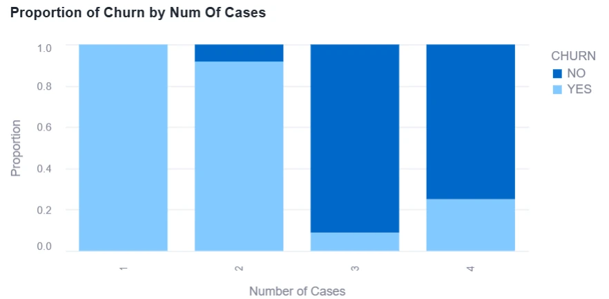
Figure 1: Example of Exploratory Data Analysis in Snowflake/Snowpark
Additionally, EDA involves looking at the cleanliness of the data from cardinality (number of distinct values) to null values and ensuring the data makes sense. In order to visualize data cleanliness, we will use the same bar charts as above while also creating line graphs and box plots for the different features. Thankfully, in Snowpark, building visuals like these is a breeze using Snowpark’s Python-based Worksheets and Notebooks.
Step 3: Data engineering and building the training dataset
Working through EDA is a cyclical process, and sometimes involves some feature engineering. When we need to restructure the data to create new features, we can go ahead and apply a Data Pipeline in Snowpark to perform a variety of transformations that make it easier for the model to recognize patterns in the data to make predictions from.
Within the data pipeline, we will do the following steps: one-hot encode the data, impute the null values, and standardize each of the now numeric data between 0 and 1. One-hot encoding involves taking categorical values and turning them into numeric ones. Let’s take gender for example — instead of female and male, it would be 0 and 1.
Snowpark provides a lot of flexibility to go through this process, ranging from any additional data preparation that may be required to the generation and storing of prediction values.
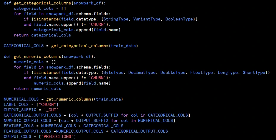
Figure 2: Example of Python Hosted in Snowpark to Generate Training Data and Train Model
Step 4: Training the model
Once we have our features prepped, we can start plugging them into a model. For this use case, we used the XGBoostClassifier model to predict churn.
First, we do a few different trials of the model with different combinations of input features — it is important to make sure that the model has the right input data to make a prediction. After a few iterations of model development and calibration, we choose the “best” one (i.e., the model that has the correct balance of model accuracy, interpretability, and business value).
Once the model is chosen, we can generate our accuracy metrics and do some additional interpretation using a statistical tool called SHAP values.
Step 5: Interpretation of the model
Feature importances are often valuable when trying to interpret a predictive model, and can be deduced through the use of SHAP values (or SHapley Additive exPlanations). SHAP values help explain what individual features that went into the model are driving the score given to records. This means SHAP values can be negative or positive.
In other words, the input feature could increase the predicted score or decrease the predicted score given to a record. SHAP values are easy to calculate in Python and, therefore, can be utilized in Snowpark, providing a powerful tool for model explanations in Snowflake.
For example, if one of the input variables to the churn model is the duration (i.e., the duration the client has had an account at Fleischer Tech), we can examine a handful of records to see the impact that duration of business has on the likelihood of retention.
Below we can see a visual that represents all the features in our model, with each individual SHAP value plotted. The key idea is that the impact of a feature can be different for each individual observation. If we look at the duration variable, we can see the longer time a customer has been around (i.e., red dots), on average, the higher the likelihood of retention.
On the flipside, if we look at the blue dots for duration, the accounts that haven’t been a client for very long are associated with a lower likelihood to retain score. In short, we can conclude that the longer a client has had an account with our organization, the more likely we are to retain them as a customer — and the predictions from the model we’ve built will take this insight into account.
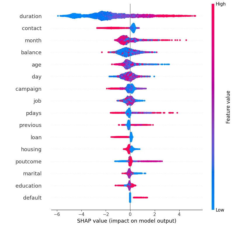
Figure 3: All Model Features with SHAP Values Plotted
Step 6: Model maintenance and monitoring
Once the model has scored all the records, we can use these to drive accuracy metrics to see how good the model is at predicting our response variable on new records. We can then also develop actionable insights from input features and SHAP values. Meaning, input features (e.g., days since last task, number of calls, days since last visit, etc.) can be used with their SHAP values to figure out what the sales rep needs to do to increase the score and make the customer less likely to churn.
Leveraging insights via Streamlit
One other handy tool that Snowflake provides is the ability to build and host Streamlit apps natively. This provides a potential way to build functionality that leverages both the data in Snowflake as well as outputs from the predictive model in Snowpark.
Here’s an example of a simple app that allows managers and reps at Fleischer Tech to better understand the top factors influencing a customer’s likelihood of churn. In this case, the customer (Cruz, Christian and Chambers) has a relatively high likelihood of churn.
The app dynamically filters to the SHAP values that are relevant for this customer. In this case, it appears that the high likelihood of churn may be due to this account being relatively new, and a lack of overall engagement demonstrated by a low level of cases and historical spend.
Apps in Streamlit could be used to present model results to a wider set of stakeholders, and in cases where more actionable features/recommendations are necessary, tools like this could be valuable in driving more automated next-best actions.
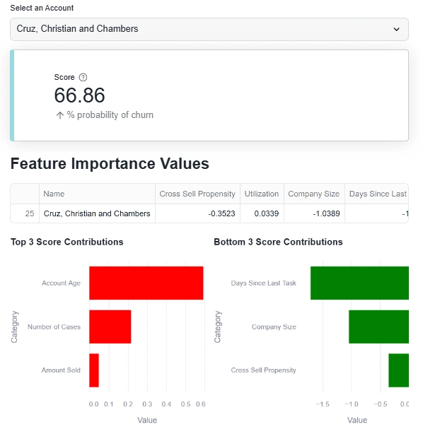
Figure 4: Streamlit App Showing Relevant Values Influencing Customer Churn
Ready to leverage AI/ML to make better decisions?
Perhaps you’ve already made the investment in Snowflake as a data platform, but you want to make sure you’re leveraging the full capabilities of the tool. Atrium can help.
We have a dedicated history of building AI solutions — both predictive and generative — and are experts at taking models like this to production in Snowflake, Salesforce, and more. Check out our Snowflake consulting services to learn more.