

Always Be Closing With These 7 Tableau Sales Dashboards
It’s important for sales teams to be able to track a variety of metrics, from pipeline to closed deals and beyond. How can you best use Tableau to not only track those metrics but make them actionable — and make your team stronger as a result?
Here are 7 Tableau sales dashboards that will help your team close more deals.
1. Booked and Weighted Pipeline vs. Quota Dashboard
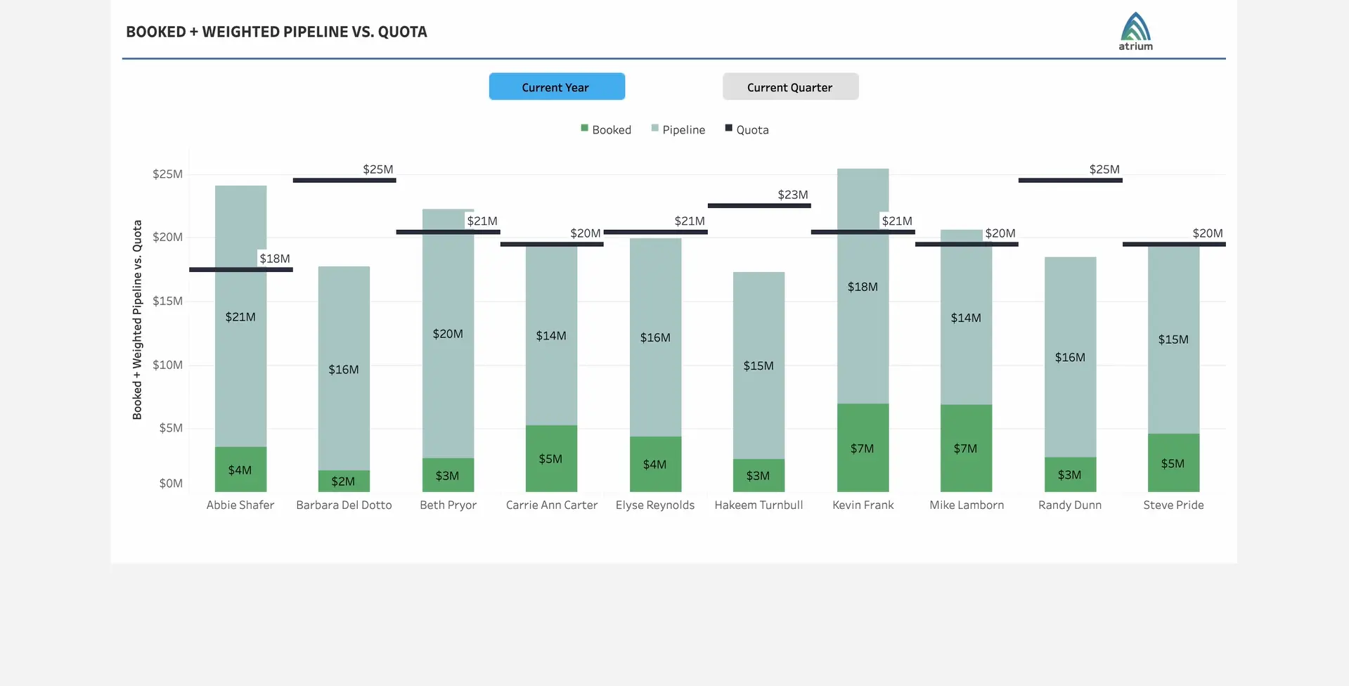
Your sales reps all have quotas, and as a sales leader, you’re interested in knowing how far along your reps are toward hitting their targets. But while it’s interesting to know the state of their current bookings, it’s also important to know how your reps are trending and how their open pipeline will help them reach their goals.
With the Booked + Weighted Pipeline vs. Quota dashboard, you can visualize just this. For each sales rep, you can see a stacked bar with bookings (closed-won deals) and weighted pipeline (total pipeline adjusted for likelihood to win). Finally, you can see a line showing quota, allowing you to compare the stacked bar against this number to see how your reps are projected to do against their goals.
2. Pipeline Shortfall Dashboard

In order for your sales reps to hit their quotas, they first need a sufficient amount of pipeline. A variation on the previous dashboard, a Pipeline Shortfall Dashboard on Tableau allows you to visualize the additional pipeline your reps need in order to hit their targets.
In this dashboard, the green bar represents a rep’s projected sales (equal to the sum of current closed won deals + weighted pipeline), while the navy bar represents the individual’s overall sales quota. The red line, meanwhile, is the quota shortfall (i.e., the amount of bookings the rep is missing at their current pace in order to hit quota). Note: We are able to customize this so that you can toggle between the quota shortfall and the pipeline shortfall, as explained below.
By hovering over each rep’s bar chart, you can see the value of each metric listed out with more precision. You can also see additional stats here, such as the rep’s average close rate and their pipeline shortfall, which is the additional pipeline (rather than bookings) needed to hit quota (modified to account for each rep’s average close rate).
3. Activity Planning Dashboard
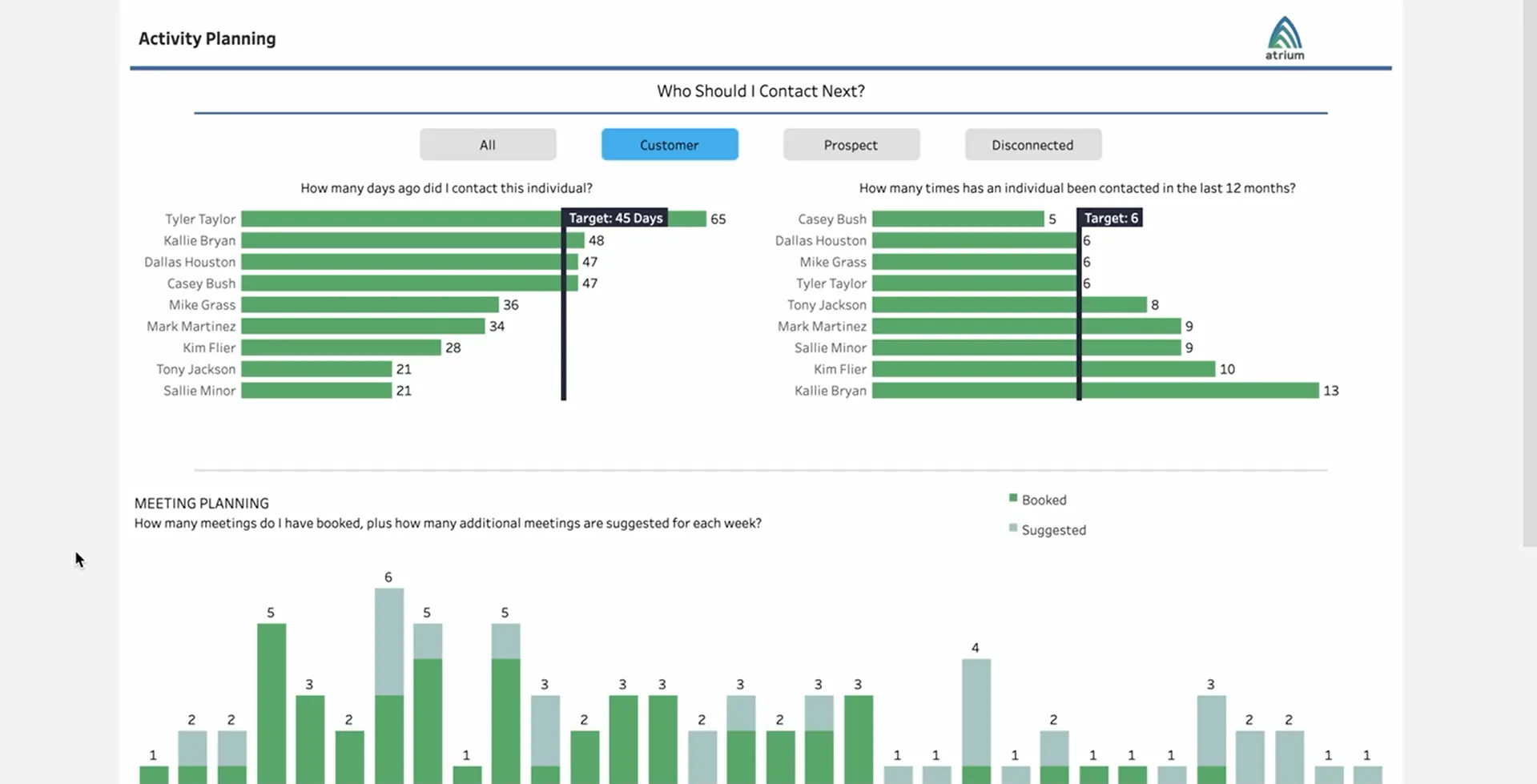
Salespeople have plenty to do and often have a large number of contacts they can reach out to, but whom and what activities should they prioritize? Tableau can help answer this question by using data to rank-order contacts based on the right criteria.
With the Activity Planning dashboard, your sales team members can see a view that shows a list of contacts, prioritized based on various metrics, such as:
- How many days since someone has reached out to the contact
- How many times a contact has been reached out to recently
- How much time has passed since the last meeting with the contact
In addition, you can include predictive elements in your dashboard. For example, displaying a rank ordering based on whether Einstein says that a sales rep ought to meet with a particular contact. And, as a sales rep or manager, you can see this in aggregate — as in the stacked chart titled Meeting Planning with green for Meetings Booked and teal for additional Meetings Suggested. This can help you analyze how you’re doing and whether you’re coming close to the number of suggested meetings. Moreover, your reps can filter based on current customers, prospects, and more, so they’re focusing on a particular segment.
4. Activity Tracking Dashboard
The Activity Tracking dashboard on Tableau is helpful for sales managers and RevOps professionals. Easily visualize and compare activities by market, industry, manager, and sales rep (or customize and choose other data points) to identify trends in activities over time.
With this dashboard, you can explore trends and cross-dimensional relationships to get to hundreds of potential combinations in just a few clicks. (As shown above, you can select filters at the top for many of these characteristics, change the overall timeline, and/or look at activity on a weekly, monthly, quarterly, or yearly basis.)
By noticing, for example, a correlation between activity count and a sales rep, region, or a combination of factors, you can draw inferences about ideal activity counts or types, as well as find a starting point to investigate further.
5. Pipeline Maintenance Dashboard

When investigating sales metrics in Tableau, having a seamless connection between Tableau and your CRM system is clearly important — you need your customer data to flow into Tableau to gain relevant insights. But having a strong connection here can go further to help your reps take actions on those insights and drive efficiency.
The pipeline maintenance dashboard shown above allows reps to see all of their open opportunities, organized by close date, amount, or other relevant fields. They can then take actions directly in Tableau to update their Salesforce opportunities via Salesforce Flows, such as updating the Stage and changing the Close Date. This way, not only do they get a powerful dashboard view, but they can take action without switching applications as well.
6. Quota Scoreboard

With the quota scoreboard, sales managers can view progress to quota across their sales team and highlight particular members for review. The top section of this Tableau sales dashboard has multiple sales performance metrics at a glance per rep, such as the quota, the # of opportunities closed, YTD sales, % quota attainment, as well as projected sales (based on current sales + weighted pipeline) and projected gap to quota.
The component spanning the left side displays YTD quota achievement with bars for each sales rep so they can be compared. Finally, on the right side, you can see a list of the rep’s opportunities with additional information. Easily filter by sales rep in the top right.
7. Metrics Leaderboard
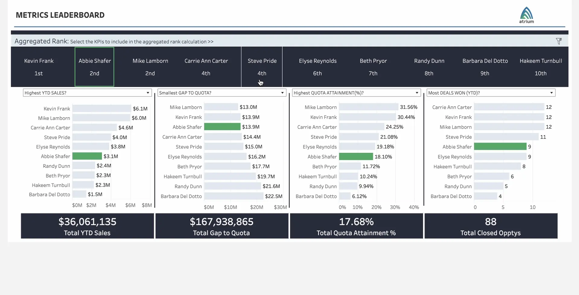
Last but not least! A sales leaderboard is a great way to get an overview of your sales team’s success from a leadership perspective, and also gamify and motivate your sales reps by letting them see where they rank.
With Tableau, you can create this for your team to compare various metrics, such as which reps have the:
- Most sales ($ value)
- Most deals won
- Most opportunities
- Largest weighted pipeline
You can also see who’s doing well across a combination of these statistics with an aggregated index (as shown in the “Aggregated Rank” at the top of the image).
Interested in learning more? Our pre-built Tableau dashboards help businesses decrease time to value with Tableau, while still being customizable to fit your needs. They can also help you ideate on the different ways you could visualize various metrics for your business.
See our full Tableau dashboard gallery and let us know how we can help you take the next step.
