AnalyticsKata: Dynamically Display Sales Rep Performance Using Only Text
Sometimes the best way to display data isn’t a bar chart, or a table. Instead, you might want to create dynamic and data-powered views using just text. That’s what we’ll be doing for this week’s AnalyticsKata, where we’ll display sales performance using nothing but text! (New to the idea of an AnalyticsKata? Refer back to our very first challenge!)
AnalyticsKata: Reps by Size
DataCorp would like to redesign the way they display their top ten Sales Reps by Amount. They would like to better emphasize who the best members of the team are using text size, and they would like this list to respect any changes in the top ten ranking.
Challenge
Create a dashboard with a text widget and a date widget. The date widget should allow users to filter the top five sales reps by close date. The text widget should display the top ten sales reps based on closed won opportunity amount. The #1 sales rep should display in 32pt font size, the #2 rep should display in 30pt, #3 in 28pt, etc. Each rep should be separated by a line break. You may use either Tableau or CRM Analytics to solve this AnalyticsKata.
Data: Use the Reps by Size Data Source found here.
(Create an Analytics-enabled dev edition and use the Tooltip Dataset found here.)
And now… the solution!
CRM Analytics
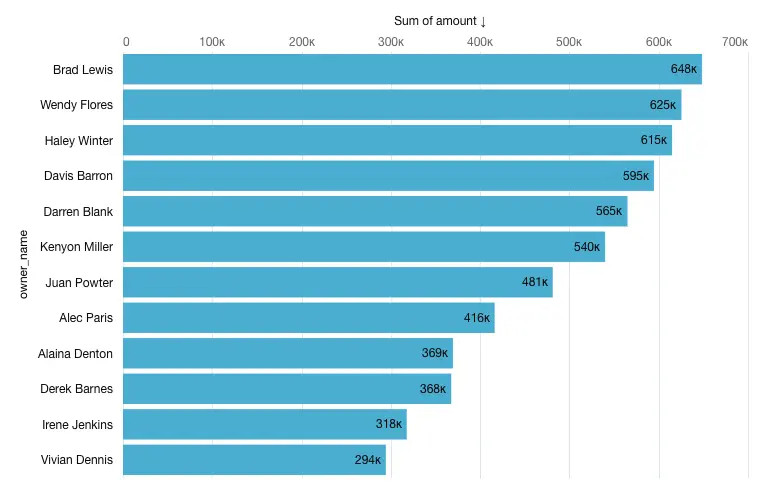
First, let’s run through this solution in CRM Analytics. After downloading the source data into a dataset, open up a new dashboard. First, let’s pull a list of our top reps by close Opportunity Amount. We’ll open up a new chart widget and pull in our Reps by Size dataset we just created, and filter to just Closed Won Opportunities. Then we’ll group it by the owner names, and set the calculation to be the sum of amount, rather than count of rows. Finally, we’ll order this by the sum of amount descending by clicking the drop down next to “Sum of Amount,” and selecting “Sort Descending.”
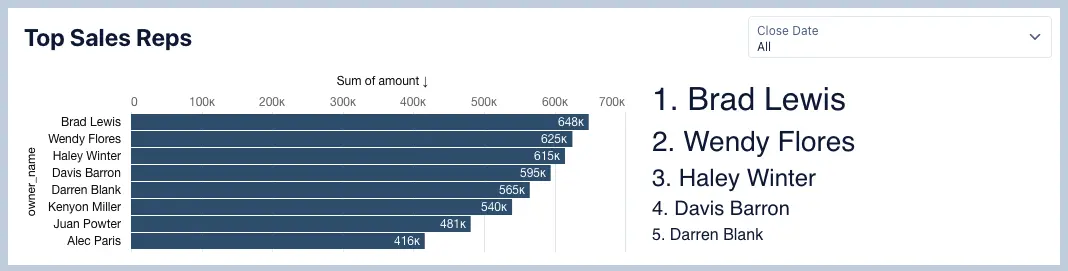
This will give us the chart below, which shows Brad Lewis as the #1 selling rep:
Now that we have an ordered list of reps, we can start putting them into a list which lists their names with a corresponding size. Hit “Update” on your bar chart and then go back to your dashboard.
To do this, we can pull a text widget into the same dashboard. Once you’ve added the text widget, click on it and you’ll see you have the ability to format your text widget however you’d like. This is where we can set our formatting for the top five users. Let’s add a list 1-5 to the text widget as shown below:
1.
2.
3.
4.
5.
Once we’ve added the list, we can then change the formatting of the list to be the sizes requested in the AnalyticsKata. For “1,” we’ll highlight the text in the text widget formatting box, and select 32 from the drop-down. We’ll do the same for “2,” selecting 28 as our text size. Repeat this for the entire top five.
Now, we need to pull the data from the bar chart we created before into this formatted text widget. To do this, we’ll need to use bindings to pull the corresponding data. We’ll click on our text widget and go into the advanced editor. Here, you’ll see the JSON that powers our text widget:

We can use this screen to reference the values from the bar chart. If you’ve never created a binding before, a binding allows you to pull data from one query in your dashboard and reference it somewhere else. That’s exactly what we’ll be doing here.
In the Advanced Interaction Editor on the right side, find your source query of the Reps by Amount bar chart, and then we’ll select some information about this. First, we’ll select whether this is a cell, column, or row binding. As of right now, we’re putting in the values for 1, 2, 3, etc. one by one. That’s because we want to have different font sizes for each of these. For this reason, we’ll be selecting reps individually, rather than an entire column of reps. We’ll use “cell” in this case.
Next, we select what is called the “Row Index Number.” This indicates what value in the list we want to pull. For example, for “1,” we want to put in the first value in the list of reps. We’ll select 0 here because in CRM Analytics, that’s where rows start — at zero instead of one. Finally, we’ll pick the field that we want to pull information from; the owner name in this case.
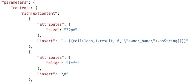
Awesome! Now our binding is finished. Let’s copy it in and place it right after the “1.” Now, we can repeat this process for each of the values in the top five. The only thing we need to change is the “Row Index Number.” For “2,” we’ll put in number 1. For “3,” we’ll put in 2 — until we’ve reached “5.”
Now all that’s left is to add our Close Date Filter. Let’s pull in a date filter from the side and click on it. Now you can click the close_date field and add that into the dashboard.
Those are the steps! Play around with your filter and see how your reps change in your bar chart, and are then reflected in the list!
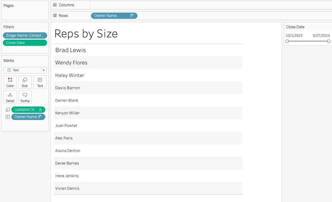
Tableau
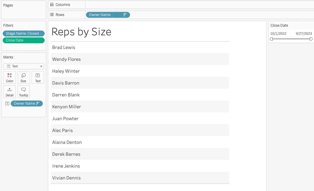
Let’s do the same thing now in Tableau! Add the data source to your Tableau environment, and open up a new workbook. Unlike in CRM Analytics, we don’t have to create the bar chart of the top-selling Sales Reps; Tableau doesn’t reference other views the same way CRM Analytics does with bindings. Instead, we just pull all the information we need into the same view.
First, let’s pull our owner_name field into the “Text” box of the marks card. Doing this will give us a list of reps that are represented in the data source. Next, we’ll pull a filter for Stage Name onto the filters pane and select just “Closed Won” opportunities. Let’s also pull in the Close Date field, since we’ll want to be able to filter based on the Close Date once we’re done with our visualization. Right now, we have something resembling a word cloud. To make it into a list, pull the owner name into the rows section of the view. Doing this will order your rep names, but also duplicate them. To remove the duplication, you can simply right click on the names on the left and uncheck “Show Header.” Ensure you also have “Text” selected in the drop-down of your marks card rather than Automatic — to ensure it will give you a text list at the end.
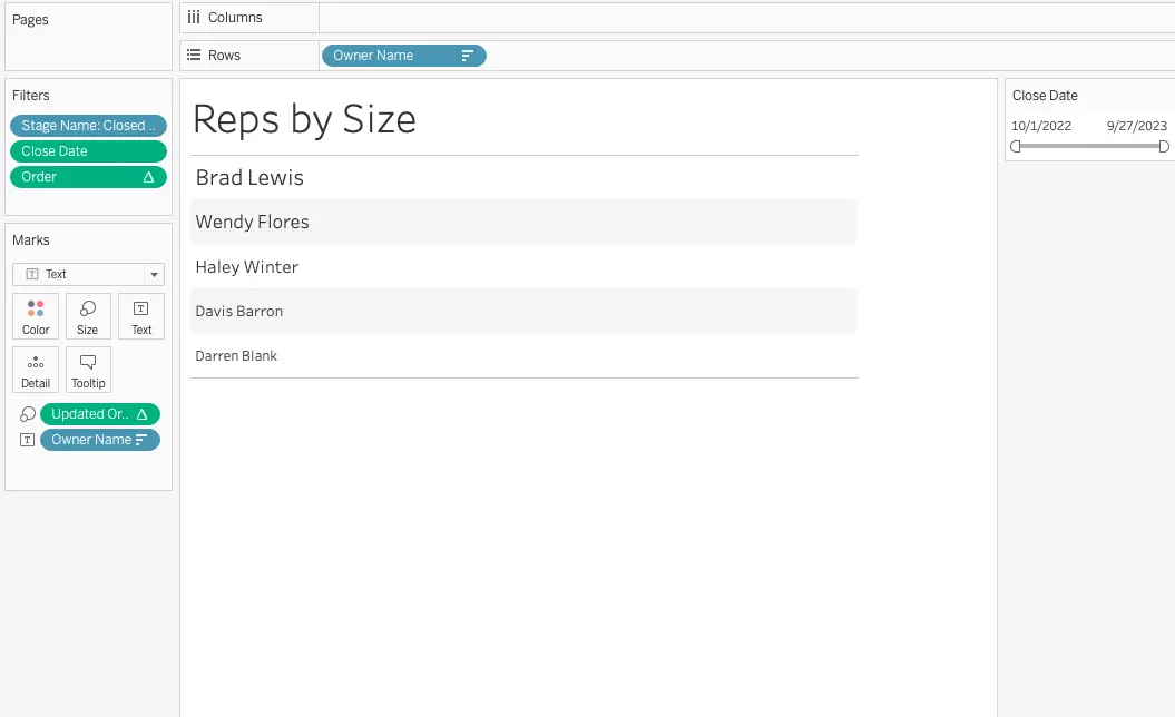
Now, we want to rank these reps based on their performance so that we can pull them into the buckets in the AnalyticsKata challenge (size 32 font for #1, size 28 for #2, etc). In Tableau, there isn’t a way to directly match the sizes represented in the AnalyticsKata challenge, but we can get pretty close.
To start off, we’ll need to rank our reps based on their performance. To create a Rank function, let’s right click on the amount field and “Created…Calculated Field.” We’ll want to rank our reps based on the sum of the closed amount they have. To do this we’ll use a dense_rank function on the sum of the amount field and sorted descending. I’ve called mine “Order.”
With this rank field created, now we can transform it into a similar ranking to what we have in CRM Analytics. Right click on your calculated field, and create a new calculated field. In this case, we’ll be using a case statement to transform the values in the rank function. If the rep comes in as rank #1, we’ll give them a value of 32, if they come in as #2, they’ll have a rank of 28, and beyond. See below for the calculation used:
I’ll pull that Updated Order field onto the “Size” section in the marks card. You’ll notice all the sizes look pretty similar; it’s a bit hard to tell the difference in size. If you want more differentiation between your sizes, you can change the values in your updated order calculation. I used 250, 150, 100, 75, and 50 to make it a bit more obvious. You can also change the size of your base font by clicking on the owner name field in your marks card and going into the “Format.” I changed the font size on the Pane tab to have a base of 14.
Our view is looking pretty good. The only thing we need to do now is just limit the list to the top five. To do that, all we have to do is pull over our original order field and set an upper limit of 5.
And there we have it! The same Reps by Size chart we created in CRM Analytics.
Stay tuned for more challenges! In the meantime, learn more about our Salesforce CRM Analytics consulting services.