AnalyticsKata: Converting a Dashboard to Light or Dark Mode
If you’re no stranger to the internet, you likely know that many websites include the option to view pages in both light and dark mode. Light mode is generally a white or light-colored background with darker font, while dark mode is the opposite. Did you know that within CRM Analytics, you can create toggles that swap between the two? (New to the idea of an AnalyticsKata? Refer back to our very first challenge!)
AnalyticsKata: Light mode and dark mode
DataCorp has officially bought into the dark mode trend, and they have requested that you convert an existing dashboard from “light mode” (white background, dark text) to “dark mode” (dark background, light text). However, they would like to maintain the ability to view the dashboard in light mode.
Challenge
Using any dashboard you’ve created for a previous AnalyticsKata, or otherwise, add a toggle to the dashboard that allows users to toggle between dark and light mode.
Create an analytics-enabled dev edition and use the existing DTC Opportunity Dataset.
And now… the solution!
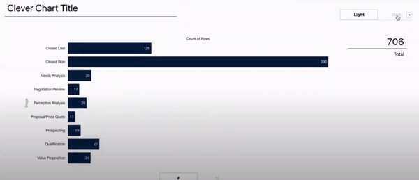
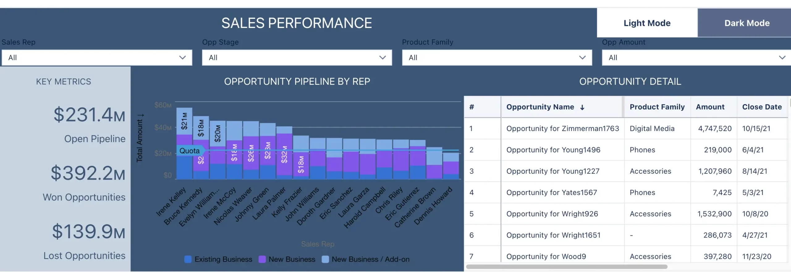
For this week’s dashboard, I’ll be redesigning a sales performance dashboard I developed when I was studying for the CRM Analytics exam, but you can complete this AnalyticsKata for any dashboard you’ve developed.
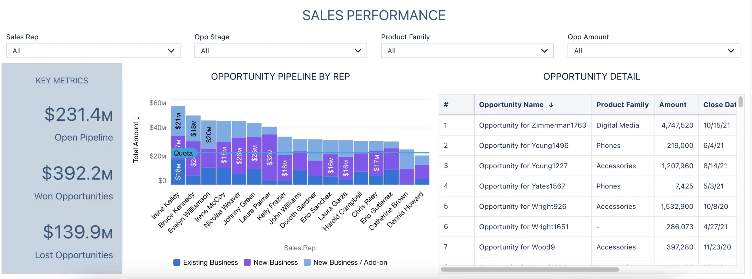
Before I began to implement the dark/light mode functionality, I ensured my dashboard had a “fine” row height, and 0 cell spacing. This will remove any whitespace present in your dashboard. It is not currently possible to change the background color of a dashboard, but you can change that of individual widgets. For this reason, make sure you don’t have any blank space on your dashboard. If you do, just replace it with a blank text widget.
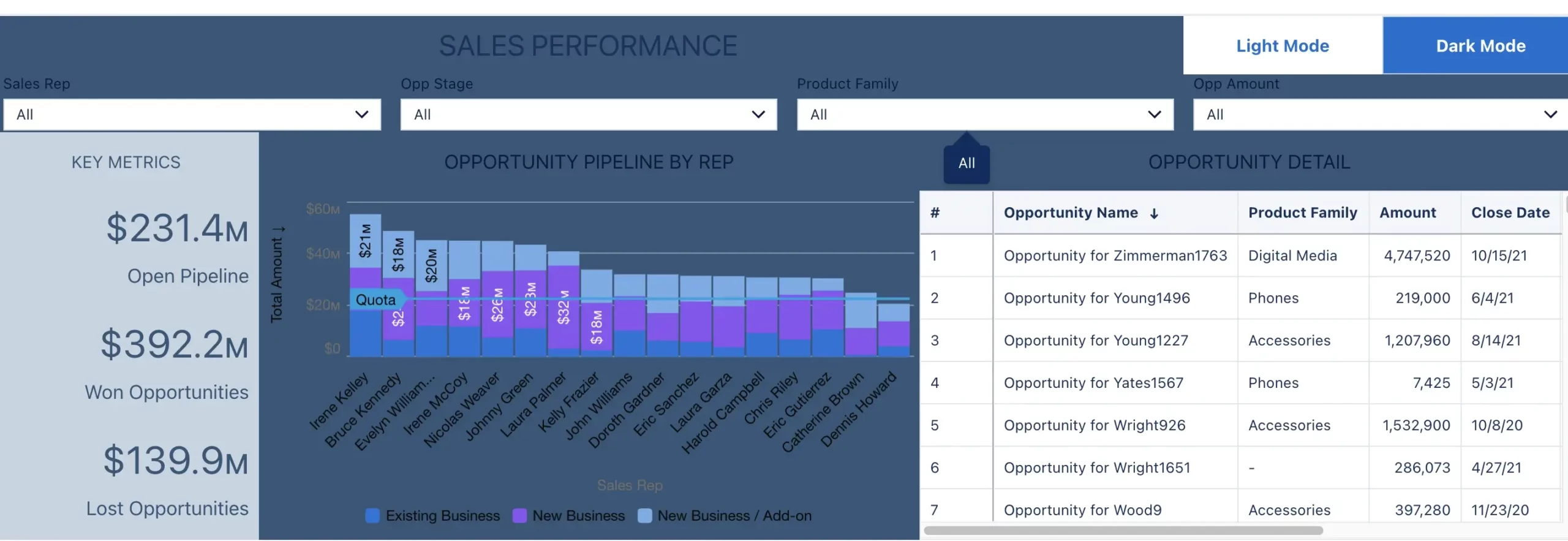
Let’s start with changing the background color of all the widgets on the dashboard. First, we’ll need to create a toggle selector that allows the user to swap between the two versions of the dashboard. Let’s add that in the top right corner. Drag a toggle into the top right.
Next, click create query on the right hand sidebar. We’ll want to create a custom query that uses hex codes to change the color of things in the dashboard. Put one row with the title “Light Mode” and another with “Dark Mode.” Now, pull that query into the toggle. Then, click on the toggle and select “Query” on the right side to ensure this toggle is Single Selection Required. This ensures that someone always selects something in the dashboard. This is the first step toward creating our working toggle.
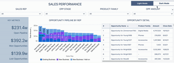
Background colors for light and dark mode
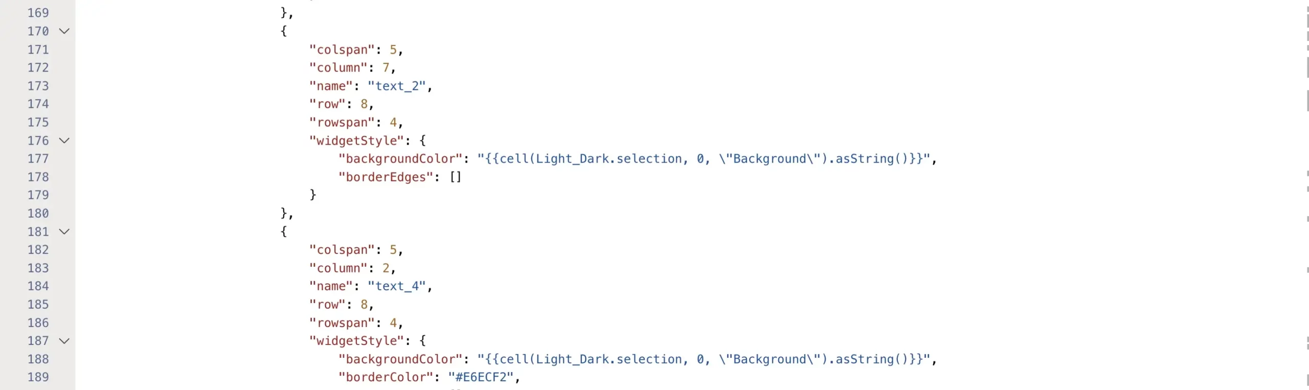
Now that we’ve done this, we need to select the background colors we want to use for both light and dark mode. For light mode, I’ll be using #ffffff and for dark mode I’ll use #335779. Let’s put these in the next column of the query that powers our toggle, calling that column “Background.” Now, let’s create our binding to change the widget background color. I opened up a widget in the advanced editor to generate my binding. After selecting the query that powers my toggle, I selected cell, 0, and background, before choosing selection. With this binding we can go into every widget and replace the background color depending on our toggle selection.
My binding looked like this: {{cell(Light_Dark.selection, 0, “Background”).asString()}}
Copy your binding syntax and open up the dashboard JSON by clicking Ctrl + E on a PC or Cmd + E on a Mac. Because all the widgets in my dashboard had the same background color, I was able to search “#ffffff” and replace every instance of it in my dashboard JSON with the binding we generated earlier.
One trick that helped me make sure I was replacing the right widget was to change the background color to something completely unique. This ensures that if a color exists in your dashboard, but it is not a background color, it is not replaced.
My dashboard now looks something like this:
Next, we’ll need to ensure we’re changing the text color for each of our widgets. But before we start that, we need to choose our colors for our text widgets and add that to the toggle the same way we did previously. Select your text colors and open the query powering your toggle. I made a new column called “Text” and added “#16325C” to the light mode row and “#ffffff” to the dark mode row.
Now we can begin changing the text colors. Let’s start with the text boxes and title, excluding only the graph and table. I changed the color of all my text to another unique color once again to make things easier. After doing so, I searched the hex code of the unique color in the dashboard JSON and replaced it with another binding, swapping the text color. Return to your dashboard and you should be nearly finished!
You’ll notice here that the titles of the filters didn’t change when you added the binding to the chart title. For some reason, text color bindings do not affect the background color of list or range filters. You can get around this by converting them from combo box to pill filters, or simply adding a text box on top of the chart that can convert. I opted for the second option, applying both the background and text bindings to those widgets as well.
Finally, the chart and the table
Now, all that’s left are the chart and table. For the chart, one thing that makes light mode and dark mode easier in CRM Analytics is that many of the chart widgets already have built-in dark and light mode versions! We simply have to change the style of the chart to a dark mode chart and we should be all set. The two themes we want to toggle between are called “light” and “dark” within the chart JSON, so let’s add those options to the toggle query in a column called “Chart.”
Now, let’s open up the individual JSON for the chart, and add a binding to replace the value that comes after “theme” with a binding for the “Chart” column in our toggle.
That’s it! The chart will change from light to dark mode easily.
All we have left is to modify the table. The interesting thing about tables is that there are themes, similar to charts, but those aren’t stored in the JSON. Instead, there are several different places where you can customize individual aspects of the table, such as header text and color, cell text and color, borders, or backgrounds. Turning this one into dark mode might be a little more challenging!
Let’s focus on the background and text colors for this example to start. Let’s use the existing text and background color options that we have selected for our dashboard already. Go into the table’s advanced editor and add the bindings for background and text wherever you find a corresponding value reading background or font. What do you know? Just like list and range widgets, it’s not possible to change the colors of a table. As far as I know, there is no workaround. That leaves us with our final dashboard of converted widgets!
Stay tuned for more challenges! In the meantime, learn more about our Salesforce CRM Analytics consulting services