AnalyticsKata: CRM Analytics Pie Chart vs. Bar Graph
If you’ve worked with bindings in CRM Analytics dashboards, you’re likely already aware of the amazing capabilities that they provide. Bindings allow you to dynamically change groupings, calculations, and more in charts and tables. But did you know that you can also use them to change chart types?
For this week’s Kata, we’ll be using bindings to change a bar graph into a pie chart with the click of a button! (New to the idea of an AnalyticsKata? Refer back to our very first challenge!)
AnalyticsKata: CRM Analytics Pie Chart vs. Bar Graph
Challenge
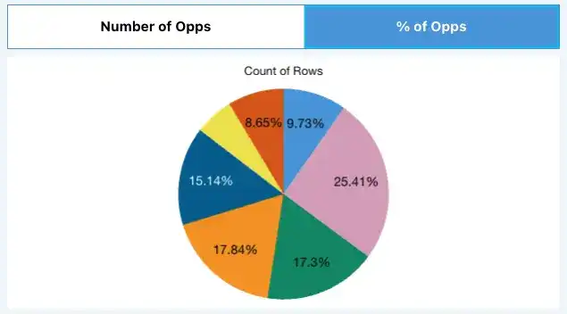
Data Corp is looking to create a dashboard where users get more information about the opportunities they have in their pipeline. They want to be able to toggle between the number of opportunities open and the percentage of all opportunities that are in each stage. They would also like to be able to change the chart type from a bar graph for the count of opportunities to a pie chart for the percentages.
For this week’s AnalyticsKata, create a dashboard with one chart and a toggle that switches between a bar graph with count by stage and a pie chart with percentage by stage. This should be done with a toggle, not a page link, and look like the gif below:
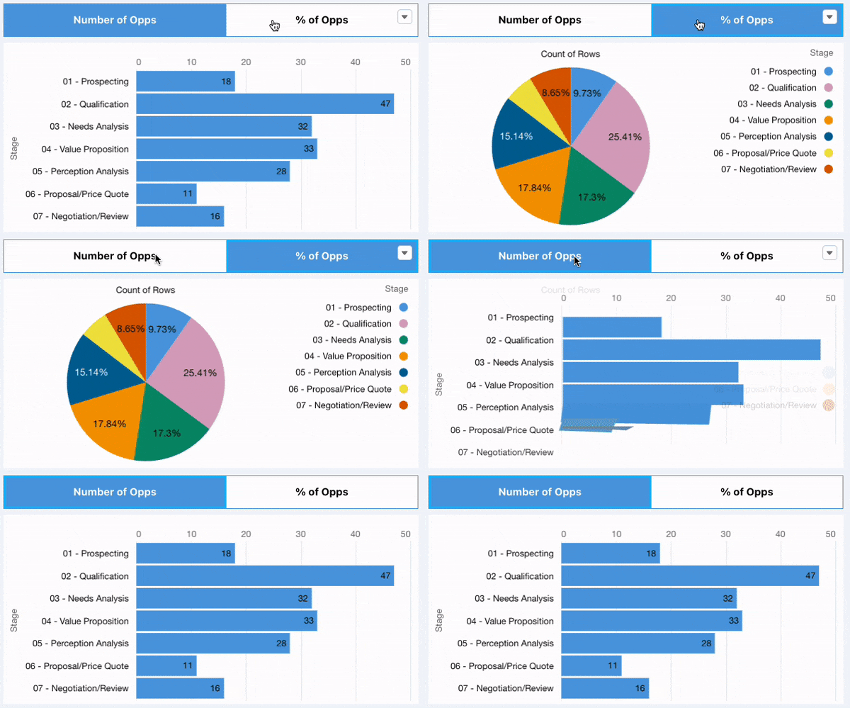
Bonus: dynamically swap the visibility of the legend as well. If the toggle selection is “% of Opportunities,” the legend should appear. If the toggle selection is “Number of Opportunities,” the legend should disappear.
Data: Please use the out-of-the-box DTC Opportunity dataset in an Analytics-enabled dev edition.
Create an Analytics-enabled dev edition and use the Tooltip Dataset found here.
And now… the solution!
Before we begin, we need to think about what these final charts should look like. First, we know that these charts should be a horizontal bar graph of the number of opportunities in each pipeline stage, and a pie chart of the percentage of all opportunities that are in each stage. Let’s start by creating both of the charts required for this challenge separately before we combine them into a single chart.
Let’s kick this off with the bar graph of opportunities in each stage. After creating a new blank dashboard, let’s open up the preloaded DTC Opportunity dataset found in each Analytics-enabled dev edition org in a chart widget.
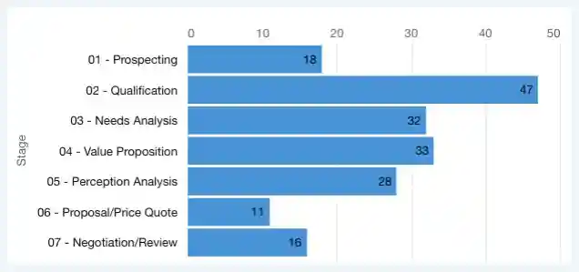
Next, we’ll need to filter this chart to just the pipeline stages of the opportunity. This includes all stages except Closed Won and Closed Lost. Then, we’ll add to the bars section of the dashboard StageName.
Awesome! We’ve got our first chart built.
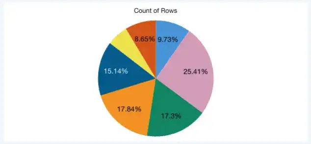
Now, let’s do the same thing for the pie chart. Open up the DTC Opportunities dataset in another chart widget, and apply the same filters, and groupings. Select “Donut” in the chart type section on the right side of the chart widget. To get this donut chart to look more like a pie chart, click on the “Donut Chart” section of the formatting, and change the Center Size to 0%.
Next, change the values in the pie chart from a number to a percentage. In the same Donut Chart section, change the “Show Values As” selection to Percentage. Now that we’ve got both of our charts, we just need to combine them and add a toggle.
Before we start combining these charts into a single widget, let’s take a look at the Advanced Editor for each widget and examine what’s required for both charts in JSON. Click on the bar graph, and select Advanced Editor in the top right. Compare what you see to what you find in the pie chart. Looking at the widget tab, take a look at both dashboard JSON files side by side. To better help you find differences, take the code into a code editor like Atom or VS code and look at them side by side.
I pulled out a few that existed in the pie chart that didn’t exist in the bar graph. You can find them listed below:
- In the parameters section, the pie chart contains:
- “autoFitMode”: “keepLabels”,
- “centerText”: “”,
- In the legend section, the pie chart has different parameters:
- “showBinLabel”: true,
- “measures”: [],
- “showNullValues”: true,
- “customizeLegend”: false,
- “showPercentage”: true,
- “showDimensions”: true,
- “showMeasures”: true,
- “dimensions”: []
- Between the trellis and columnMap sections, the pie chart contained a value of “inner”: 0,
Once I identified these values, I copied them from the pie chart’s JSON into the bar graph’s JSON in the same position that they appeared in the pie chart’s JSON. In addition to these additions from the pie chart, there were two key values that were between the widgets:
- At the top of the Widget tab, you’ll see the visualizationType for the bar graph is “hbar” while the pie chart is showing “pie”
- About halfway through the Widget tab JSON, the valueType comes in as “compactNumber” for the chart while on the pie chart you’ll see “percent”
These are the key things we’ll need to change when we create this toggle.
Let’s start by building out our toggle. Click a blank spot on the dashboard and select “Create Query,” followed by “Create Custom Query.” Our two toggle options will be “Number of Opps” and “% of Opps.” We’ll put those in the first column.
The next two columns we’ll add to our toggle are the different values we want to use in the visualizationType and valueType boxes. Let’s fill those with “hbar” and “pie” for the first, and “compactNumber” and “percent” for the second, naming the columns vizType and valueType respectively.
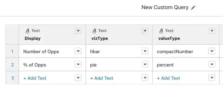
After we create the toggle, click Done, and move the toggle into a blank toggle widget above the first query we created. Make sure to make this toggle “Single Selection (required)” as we want to ensure the chart is always showing either a bar graph or a pie chart. To do this, click the toggle, and select “Query” on the top right. Then change the Selection Type to “Single Selection (required).”
One more step to get our toggle working with the charts! That step is to add in the bindings to swap the visualization type and value type. Let’s hop back into the Advanced Editor for the bar graph. On the left side, we can use the Advanced Interaction Editor to create these bindings. Our source query holds the information we want to change, in this case the toggle query named “static_1.” We’ll choose “data selection type” of “cell,” “row index” value of “0,” and “column” of “vizType.”
Finally, we’ll choose an interaction type of “selection.” This interaction type means that we have to click on the toggle, or select a value, to change the output of the binding. If we choose “result,” our binding won’t change when we click it. Our final binding should look like this:
{{cell(static_1.selection, 0, “vizType”).asString()}}
Copy the output of this binding and replace where you see hbar on the just the Widget tab of the Advanced Editor. Make sure to leave the quotation marks around it. Now let’s repeat the steps to create our binding only changing the vizType column to valueType. We’ll then swap where we use compactNumber on the widget tab.
Save your dashboard, and give the toggle a test. You should see the bar graph and pie chart swap based on what you click. If you’re getting an error, make sure you check the spelling and capitalization of the values in the table that powers your toggle.
Now onto the bonus. If you’ve noticed a theme here of the way we were able to swap the bar graph to pie chart you’ll notice we always used a binding to make these changes. We can use a binding again to dynamically turn on or off the legend. If we take another look at the JSON for our chart, we’ll notice under the legend section, there is a value called “show” which is currently set to false. We can dynamically change this to true using another binding! One thing to know about true/false statements in the JSON is that you can use a 1 and a 0 to represent “true” and “false” respectively.
Let’s go back to our toggle and double click it. We’ll add a new column called “Legend” that is a Number. Populate a 0 and a 1 for the rows and click done. You’re final query will look like this:

Now, we can do the same thing we did before with bindings, but replace the value for “show” in the legend section with our new Legend binding. This will create our final dashboard which can dynamically show the legend for each chart!

Stay tuned for more challenges! In the meantime, learn more about our Salesforce CRM Analytics consulting services.

