AnalyticsKata: CRM Analytics Tooltips
One of the great things about CRM Analytics dashboards is the ability to create dynamic dashboards that are not only nice to look at, but that also allow you to provide all the information and detail you need to make informed decisions. One great way to do this is to add dynamic tooltips to your visuals in order to provide extra context to your dashboards and make them even more powerful. We’ll be keeping that in mind for this AnalyticsKata: CRM Analytics Tooltips. (New to the idea of an AnalyticsKata? Refer back to our very first challenge!)
AnalyticsKata: CRM Analytics Tooltips
Challenge
Data Corp would like to make their Sales KPIs more informative. On their current dashboard, there is a number widget showing the sum of Amount for Opportunities that are closed won this month. Data Corp would like to add functionality to show the last six months when users hover over the KPI. Create a bar chart showing the sum of Amount over the previous six months for closed won opportunities, and embed it on the tooltip for the number widget.
Create an analytics-enabled dev edition and use the Tooltip Dataset found here.
And now… the solution!
First, we’ll need to create our KPI Query. For this challenge, we’d like to have a KPI of the Total Opportunity Closed Amount for the current month that we can later apply our tooltip to. Create a new dashboard, pull in a number widget, and select the Tooltip Data dataset. For this KPI, we want to find out the total Opportunity Closed Amount for the last six months. For this reason, we’ll apply a filter for stage = “Closed – Won” and close_date is in the current month.
Next, we’ll want to sum together the amount associated with each of these opportunities. For this, we’ll sum together the “amount” field in the bar length field of our calculation. I’ve added a “$” to the format here as well. We’ll name this query the “Closed Opps CM KPI” and click Done. Feel free to modify the query to look however you’d like, though your final KPI should look something like this:

Now to add the tooltip. While keeping the number widget selected, view the panel on the right side of the dashboard and scroll down to the section labeled “tooltip,” and select “custom.” The custom tooltip button allows you to create another visualization to visualize as a tooltip on the chart. In order to create this visual, you’ll need to check the box for “Add Visualization” and select a visualization type. For this example, we’ll be using a chart visual to view all closed opportunities over the past six months.
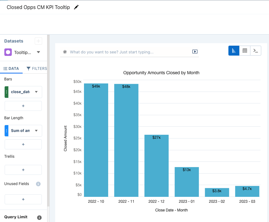
Once you select your chart type, a new lens will pop up for you to create your visual. This chart will come pre-applied with all the filters and calculations that you have in your original query. This makes it super easy to just add additional groupings or filters. For this, we’ll be adding a group for the close_date in order to view the opportunity amounts by month, and we’ll swap the close_date filter from current month to “5 months ago”..”current month.” Keep in mind that CRM Analytics treats Current Month as its own separate month, so if we want to view the last six months, we’ll need to select five months ago, as opposed to six months ago. Feel free to format your chart as you see fit. Your final query will look something like this:
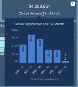
Once you click Done, you can hover over your KPI and view your tooltip:
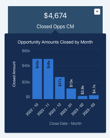
If you don’t like the size of your visual in the tooltip, you can click on your KPI, navigate to the tooltip section and adjust the width and height of your tooltip. And there you go! You’ve created your tooltip in a CRM Analytics number widget.
Stay tuned for more challenges! In the meantime, learn more about our CRM Analytics consulting services.