AnalyticsKata: Reshape Data Using a CRM Analytics Recipe
Trying to get data into the right form is half the battle when it comes to analytics. This challenge is meant to show off some of the functionality of CRM Analytics recipes, while also tackling a realistic use case. (New to the idea of an AnalyticsKata? Refer back to our very first challenge!)
AnalyticsKata: Reshape Data Using a CRM Analytics Recipe
Challenge
Data Corp has a quarterly revenue table they would like to include in TCRM. The table currently has one row for each sales rep, with four columns representing four quarters of revenue. You want to transform the data so that each row represents one quarter of revenue for each rep. Your final dataset should have three columns: Sales Rep, Quarter, and Revenue. Your challenge is to transform the data only using a recipe. See the example below:
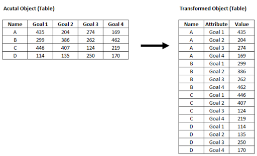
Create an analytics-enabled dev edition and use the RecipeKata #8 Dataset found here.
And now… the solution!
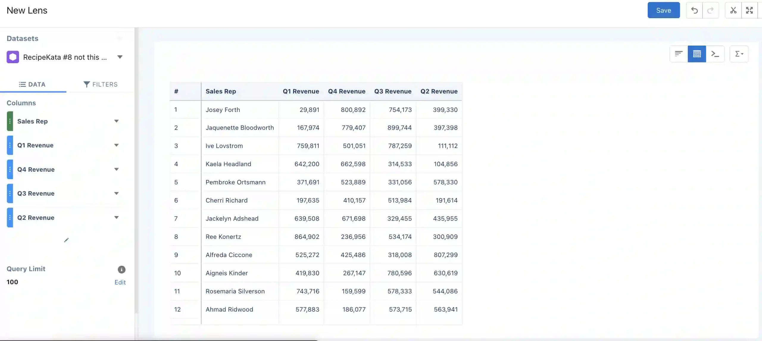
First, we’ll need to create our dataset. Start by downloading the CSV above and uploading it to CRM Analytics as a new dataset. From here, you can go into the data manager to check the upload progress. Once it’s successfully uploaded, it’s always a good idea to explore the data and make sure it looks right. You can do this by going into Analytics Studio and then clicking on the dataset, which will open a new lens. From there you can make a chart, table, or other visualization to see the current state of the data (example below).
In the initial table, we can see that the view has four columns for a single rep. We’ll want to transform this so that each quarter is a new row in the dataset, rather than a new column. Now that we understand what our initial data looks like, let’s go back into the data manager and create a new recipe with our dataset as the input node.
Next, we’ll get right into manipulating the data. We’ll start by using aggregate nodes. The function of an aggregate node is typically to “roll up” data to a higher level. This aggregation can be done by taking the sum, average, maximum, minimum, etc. of multiple rows of data. This then often results in a change in the granularity (i.e., shape) of the data.
In our data, each sales rep currently only has one row total, with the sum of revenue for each quarter showing up in four different columns. As we’ve said above, we want to change it so that each sales rep has four rows instead, with each row representing the sum of revenue for one quarter. This addition of rows changes the level of detail of our data, which is why aggregation nodes are necessary.
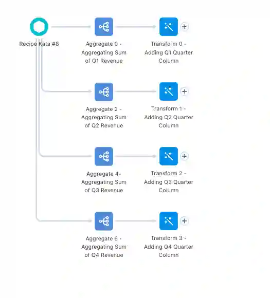
In this case, we are using the aggregation nodes to initially separate out the sum of revenue for each sales rep by quarter. So, we’ll start by creating four aggregate nodes off of the input dataset. Each node will be aggregating the sum of One Quarter of Revenue (Q1 for the first node, Q2 for the second, etc), and then grouping the rows by sales rep.
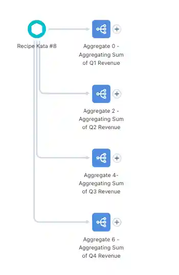
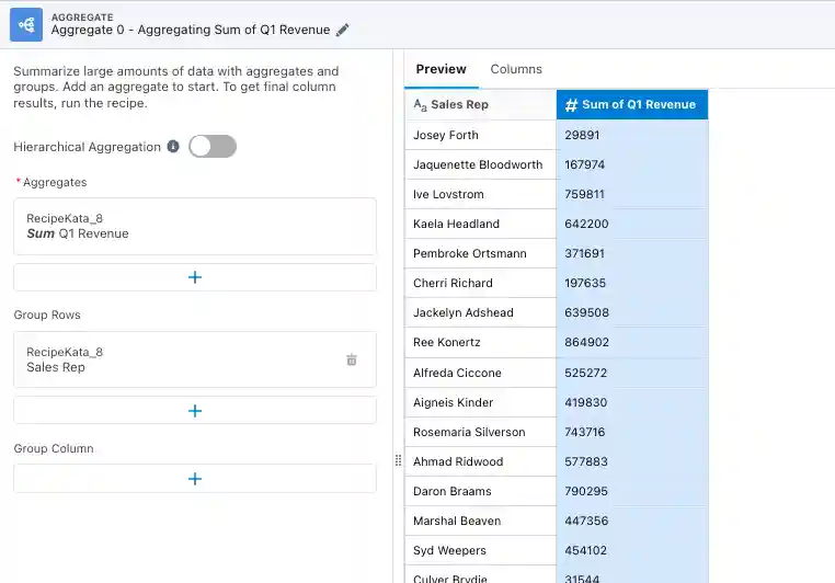
Now we have a row with the sum of revenue for each quarter, for each rep. The problem is that they’re currently all separate and there’s no column showing which quarter the revenue is for. Let’s tackle the second half of that first!
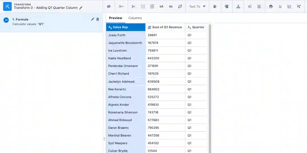
Off of each of the aggregate nodes, we’re going to add a transform node that simply adds a column that shows which quarter is being referenced. For example, the first transform off of the Q1 aggregate node will add a column that assigns “Q1” to every row.
Now that we have a way to know which quarter our revenue corresponds to, we can focus on our other issue: each quarter is still separate. The way we’ll take care of that is by using append nodes! Append nodes are used to simply stack rows from different inputs/datasets on top of each other, which is exactly what we want!
We’ll start by appending Q2 to Q1, and then appending Q3 to that previous append node, and then finally appending Q4. That will give us all of the revenue for each quarter, for each rep, all stacked on top of each other.
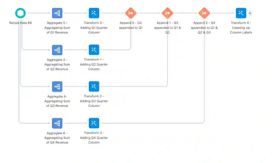
Now that we have the data in the form we want, the only thing left to do in the recipe is clean up any column names that need to be relabeled by using a transform node, and then adding an output node and outputting our new dataset!
The full recipe should look something like this:
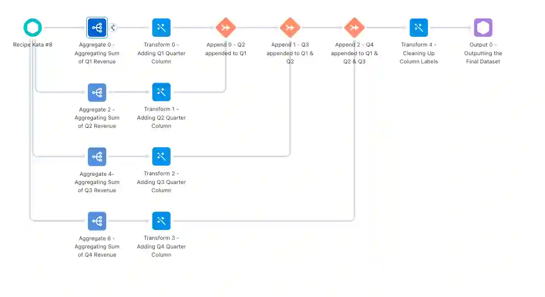
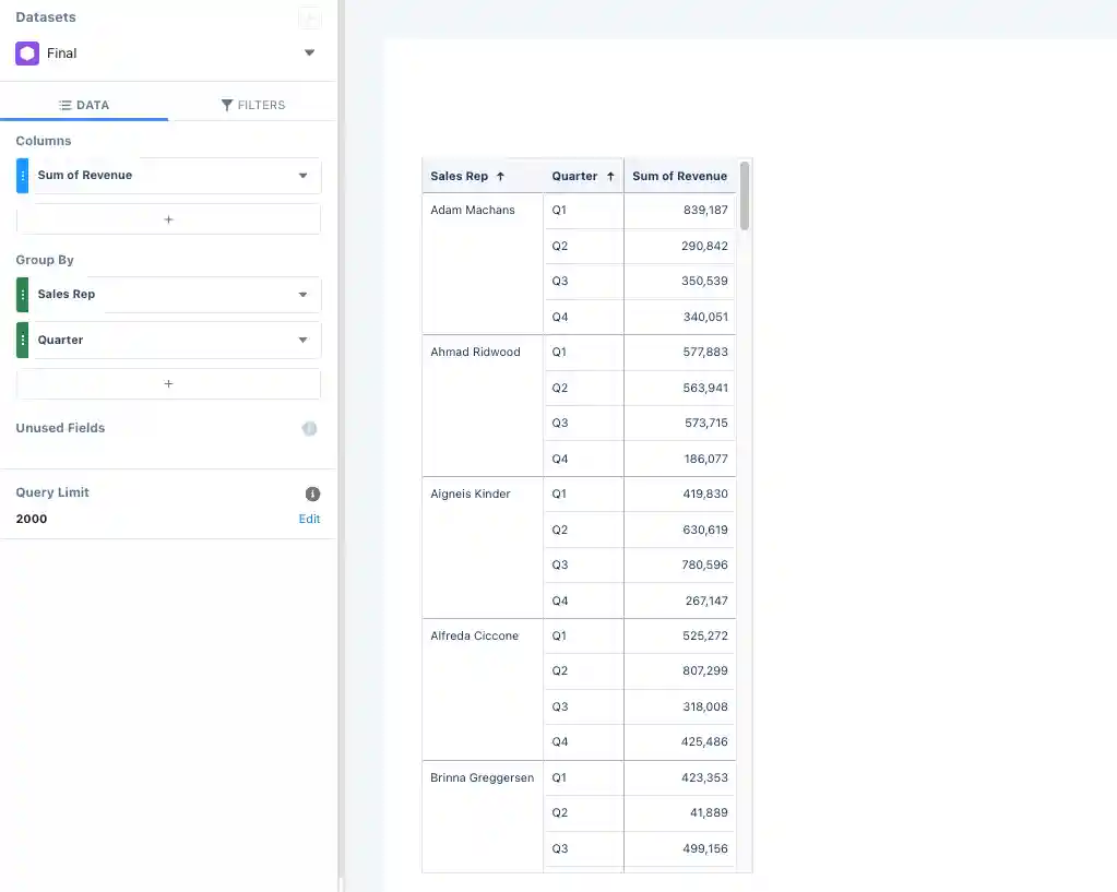
The last thing we need to do to get the data to display in the format we want is to create a lens off of our new final dataset. To do that, you just need to find the new dataset in Analytics Studio and click on it to open a new lens, just like we did at the beginning. From there, we’ll select the compare table option. In our columns section we’ll have Sum of Revenue, and then we’ll group by sales rep and quarter (in that order). That will give us the sum of revenue for each quarter, for each rep — which is what we wanted all along!
The final table should look something like this:
Stay tuned for more challenges! In the meantime, learn more about our CRM Analytics consulting services.

