


Using CRM Analytics Dashboards to Modernize Your Sales Metrics
I was chatting with my team recently and the topic of sales metrics came up and why CRM Analytics for sales is so important. We were discussing the most valuable metrics to track as indicators of sales performance and what we’ve seen most effectively done, both internally and across our dozens of Analytics customers.
Some are no-brainers – YTD Sales – but others created more discussion. How closely do Activities correlate to sales performance? How much should I factor in efficiency if someone is hitting their number? What are the most effective indicators for positive performance?
Whether it’s Salesforce’s CRM Analytics, Tableau, or another reporting tool, the ability to have meaningful sales metrics at your fingertips, including meaningful trends and predictions, has never been greater. However, we still see plenty of organizations that are trapped in their old methods of analysis.
Over the course of this blog, I’ll explore the key metrics we see playing the most significant role across Atrium’s dozens of customers to hopefully help you as you consider what you should be measuring, as well as more modern approaches to examining some traditional sales metrics. At the end, you should come away with an idea of the benefits of CRMA for sales teams.
For the purposes of this blog, I like to break down Sales Metrics into 4 main groups:
- Sales Performance – This is your baseline and what every company is measuring in some form. But beyond the basics – what’s my target and how am I tracking to it – there are layers to explore here, specifically around trending and predictions.
- Pipeline Health – If your sales performance isn’t where you’d like it to be, the next place to turn is your pipeline. It’s relatively easy to see how much you have in your pipeline… but how do you know if it’s enough?
- Activities – Perhaps the most polarizing of all Sales Metrics! The last thing salespeople want to do is record every activity in a system. And are they even a measure of sales effectiveness? We’ll examine some ways you can get the most out of activity tracking.
- Sales Efficiency – Your salespeople may be hitting their number, but are they doing it in the most efficient way possible? We’ll look at ways that they can work smarter.
We’ll examine each category of metrics, and also show you example CRM Analytics dashboards from our Accelerator Library of ways we believe you can modernize your approach to sales metrics.
Sales Performance
Total Sales leads the way when it comes to tracking sales performance. It is the dominant metric for sales, and can be sliced a number of ways across geographies, teams, or time periods (year-to-date, quarter-to-date) to truly uncover how a business is performing at the most basic level. Its most common companions are Quota Attainment and Gap to Quota. How are individuals (or teams, markets, regions, etc.) performing against their target for the month, quarter, or year?
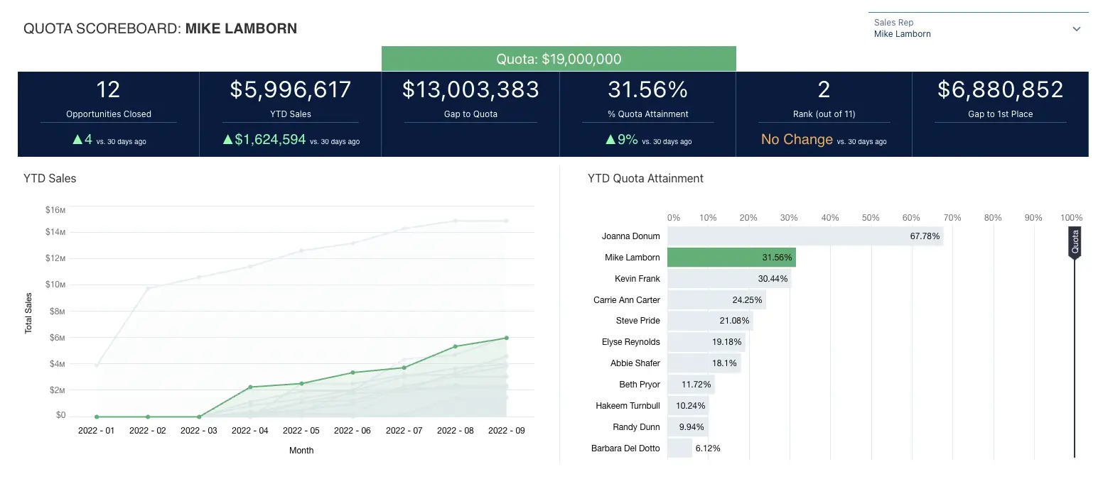
This seems pretty basic and straightforward, and it is; but leading companies are looking at indicators beyond the basic sales numbers. Sales trends, for example, should be a component of any sales performance dashboard. If Samantha Salesperson closed a major deal in Q1, that’s great! But if things have fallen off significantly since then, you want to be able to see those trends and take corrective action before Samantha falls behind. Our general philosophy when reporting on sales metrics is to always ask the question “how is it trending?” My team loves to make fun of my love of incorporating up/down arrows (▲,▼) into dashboards, but they’re useful!
On our Quota Scoreboard accelerator, you’ll see each metric is trended so we can quickly see how an individually selected salesperson is performing, as well as how they’re doing versus the previous 30 days:
Companies have traditionally loved to compare versus the prior year’s results. But as the COVID pandemic taught us, not all years are created equal. Year-over-year comparisons can be a helpful marker, but take them with a grain of salt. There are a lot of market conditions that can diminish the value of only looking at how things are trending versus the prior year.
Instead, we recommend supplementing with more granular and dynamic comparison data. A standard approach we take is to take daily snapshots of the entirety of the data we’re referencing, allowing us to trend any metric across any time period.
We captured a portion of this advanced comparison in our Metrics Leaderboard accelerator:
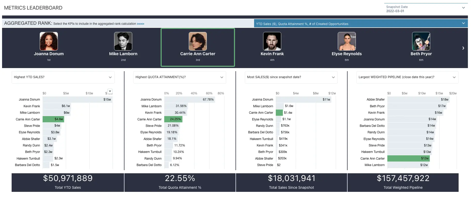
This dashboard allows a user to dynamically select from a set of 9 different sales metrics, while also choosing which of the metrics they’d like to contribute to an aggregate rank of their salespeople. From there, it’s easy to drill in and see how a given salesperson compares to their peers. In the example above, Carrie Ann Carter is doing well from an aggregate rank standpoint, placing 3rd overall and 3rd or 4th in the first three metrics (YTD Sales, Quota Attainment, and Sales since the last snapshot). However, she ranks a distant 10th in weighted pipeline – that could spell trouble for her hitting her number at the end of the year, despite the strong performance so far.
Pipeline Health
What if you look at your Sales Performance metrics and they tell you you’re not going to hit your number? The next place to dig in is an evaluation of your Pipeline, and more specifically, your pipeline health.
Many companies still take a very basic approach when it comes to establishing a pipeline target (if they even set one). It’s typically something akin to “your pipeline should be 5x of your remaining number”. In other words, they are effectively saying “we’re going to make a blanket assumption that you’re going to close 20% of what’s in your pipe”. But what if you only close the small deals and lose the larger deals?
For decades we relied on “gut feel” to establish a likelihood for pipeline deals to close. And from what I’ve seen, the majority of companies I’ve worked with still fail to leverage basic predictive capabilities for this metric (at least prior to working with Atrium!). We need to examine the layers that determine true pipeline health and give additional confidence to the age-old question of “am I going to hit my number?”
One of my favorite visualizations is simple: comparing the sum of total sales and weighted pipeline to a target, which we created as our “Booked + Weighted Pipeline vs. Quota” accelerator:
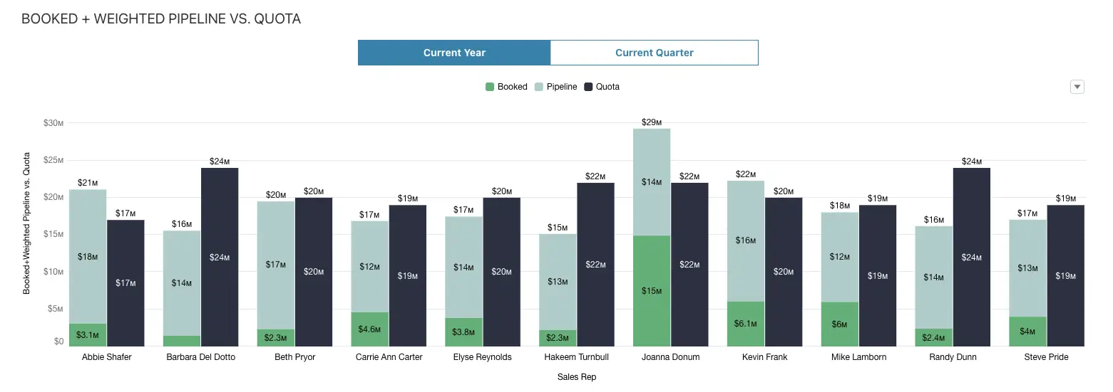
What’s great about this is that, at a glance, you know if you’re going to make it or not. Where it really gets interesting is the range of intelligence that can be built into the weighted pipeline metric. Complexity on how that value is calculated can span everything from simple (the sum of the amount on each pipeline opportunity times a blanket probability based on the stage) to intermediate (manually calculate a more specific probability based on a set of standard rules) to advanced (create a propensity- to-close model to score each opportunity and leverage that as your multiplier).
We can refine that target pipeline number even further by asking the question, “Based on a rep’s close rate and their weighted pipeline (hopefully based on a predicted propensity to close by opportunity!) and their average close rate, how much additional pipeline do they need?” We modeled the answer to this question as part of our Pipeline Shortfall accelerator:
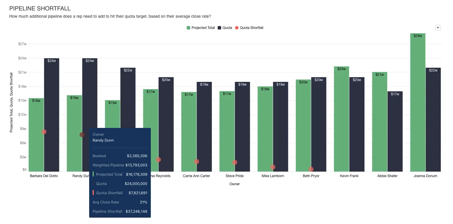
As you can see, Randy Dunn is coming up short by about $8M when comparing his Booked+Weighted Pipeline to his Quota. But how much additional pipeline does Randy need to close that gap? Based on his average close rate of 21%, Randy should plan to add an additional $37M to his pipeline in order to hit his number.
What’s nice about this analytical breakdown is that it adjusts over time as the (hopefully predictive) calculation of weighted pipeline gets refined. As propensity to close adjusts, weighted pipeline will adjust, and the remaining pipeline gap will dynamically adjust as well.
Activities
Certainly there are things that a salesperson can be doing to help bolster the pipeline and increase close rate; the most common and straightforward are tracked as activities (calls, meetings and events). However, I find many organizations have room to grow in their level of sophistication around activities. At the most basic level (which is where many organizations are at), the total number of calls and number of meetings are tracked, and the prevailing assumption is that “more is better” and that quantity of activities gives a relative indicator of sales effectiveness…but does it?
I have not seen the direct correlation you might expect between volume of activities and sales performance. High-performing salespeople usually do so by working smarter, not harder, meaning it’s not a pure volume play. In fact, I would consistently say that the highest performing salespeople in organizations we work with are not those with the greatest number of activities. So what’s their secret?
There can be several non-analytical factors – experience, talent as a seller, knowledge and confidence in the product they’re selling – but I think in addition there is a component of knowing the right activities to engage in at the right time. The quality of the activity matters more than the quantity. This is where analytics and predictions can help improve an organization’s sales effectiveness dramatically.
At a basic level, bringing in suggested meetings to an activity tracker is a good place to start. We’ve modeled this with our Activity Planning accelerator:
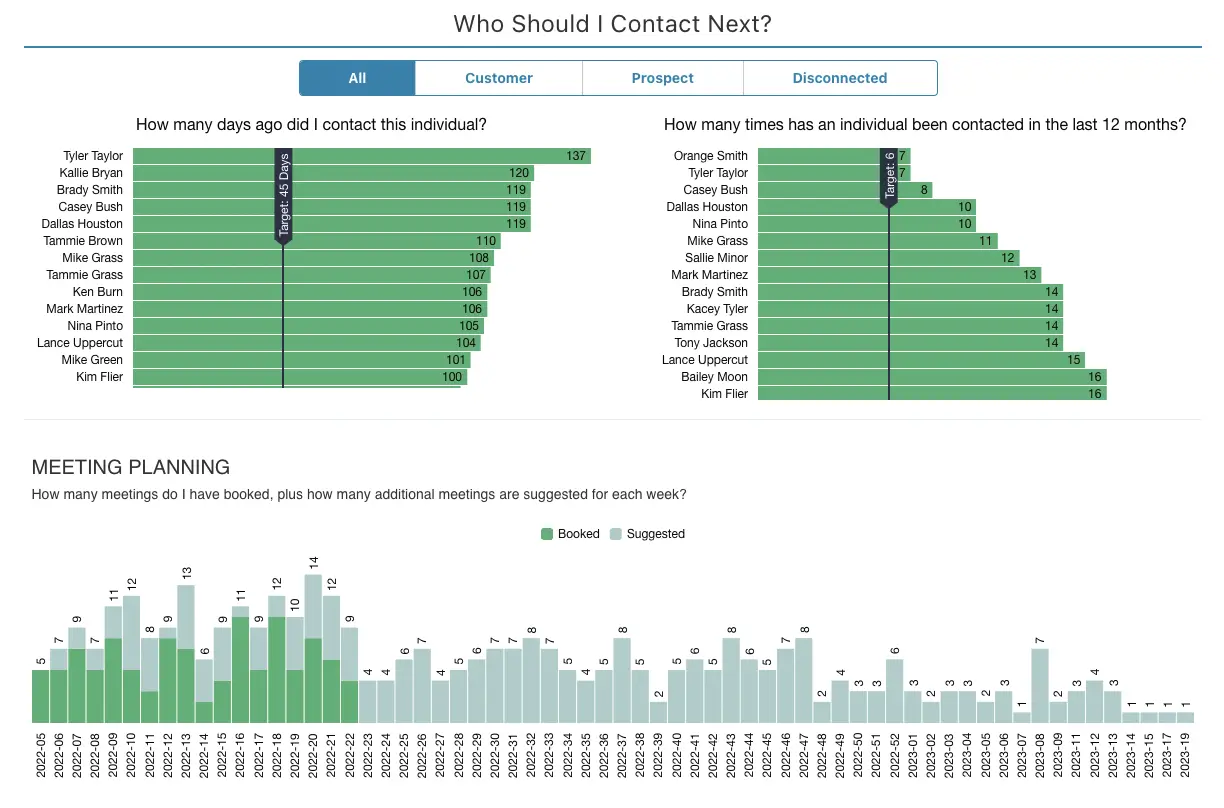
In addition to helping a salesperson quickly identify who they should next contact, the dashboard can also provide a list of suggested meetings the rep should be scheduling and help them plan their time accordingly.
Beyond that, products like Opportunity Insights (available as part of Salesforce Revenue Intelligence) can help salespeople identify suggested actions to take to help improve the health of their pipeline. It’s a great way to work smarter, not harder, when it comes to activities.
Sales Efficiency
Lastly, I’d like to touch on the concept of sales efficiency. All of the metrics above are solid indicators of sales effectiveness. But what if I want to know which salesperson is the most efficient?
Many companies start by looking at things like average time to close, win rate, or average activities per opportunity. These measures are okay, but they naturally encourage poor data hygiene. If I’m a rep and I wait to enter an opportunity in the system, or don’t record every activity, it will make me look more efficient – that’s not what we’re going for.
Instead, we need to focus on the quality of activities, not the quantity. We should examine win rate based on opportunity amount rather than count of opportunities, and we should only start including an opportunity in our win rate calculation after it reaches a certain stage so that reps aren’t incentivized to refrain from capturing early-stage opportunities in our system. Furthermore, we should incentivize good data hygiene procedures, like entering all opportunities early and capturing all activities, so that salespeople aren’t tempted to game the system.
One customer example comes to mind, where the organization took the time to calculate not just how a salesperson was performing against targets – what they referred to simply as “Results” – but also whether or not they were achieving those results by following established best practices for their sales team – what they referred to as “Way”. They scored each of these, both in aggregate and for individual metrics, to create an at-a-glance view of how a rep was doing:

As you can quickly see, this rep (Amy B) was on target with her numbers, but was missing some steps along the way to get an equally positive traffic light score for “Way” for her overall Summary measures. Conversely, she was doing things the right way for “Capacity”, but despite that was missing her target results.
If we look outside the corporate world for further validation of this thinking, we’ve seen this type of statistical analysis come to dominate baseball over the last decade in the form of sabermetrics. Where in the past, something like ERA (Earned Run Average) would be a fully accepted measure of the effectiveness of a pitcher, sabermetrics now looks to FIP (Fielding Independent Pitching), which factors out scenarios where defense behind a pitcher either improves or hinders the pitcher’s ERA.
Adopting a similar mindset for your business is recommended. Taking the time to think through and report on not only the base level results but also the process by which those results were obtained is where leading companies are differentiating themselves from the competition. CRM Analytics for sales can help you close that gap.
Next Steps
Hopefully the above has helped with some organizational self-evaluation. Have you implemented a modern approach to measuring sales metrics, or are you stuck evaluating sales “the old way”? Have you incorporated trends and predictions into your dashboards, and have you surfaced those insights in the context of where salespeople are doing their work? Is it easy to take action from those insights? If an honest self-assessment isn’t answering those questions in the affirmative, it’s likely past due that your organization reevaluates its approach to sales metrics. Luckily, the switch to CRM Analytics dashboards does not have to be a daunting task.
At Atrium, we’d be happy to help! In addition to a wealth of experience and context from dozens of forward-thinking customers, we also believe in the power of repeatable best practices. As such, we continuously add to and enhance our Accelerator Library, an easy way for you to drive speed and value to your implementation of CRM Analytics or Tableau. Contact us to learn more!