Visualize and Prevent Customer Churn in Salesforce Using Tableau CRM and Snowflake
By: Katie Toyoshima, Aurora Rosin, & Nate Van Roosendaal
In the first installment of this blog series, we took a look at Magenta Inc.’s issues with customer churn. In Part 2, Magenta’s Senior Data Architect, Jake, integrated the company’s data into Snowflake, alongside existing data from Salesforce. The data from the centralized data hub was an integral asset in Part 3, where Atrium’s data scientists developed predictive models that help Magenta quash customer churn before it even happens.
You’re probably wondering, “how do we make all of this amazing work digestible and accessible for Elaine and her team at Magenta?” That’s where Tableau CRM and the Snowflake connector come in to save the day! We also have an infographic showcasing this series.
Connecting Snowflake to TCRM
Now that all of our external data is in the same Snowflake table, we can use the Snowflake Input Connector to sync the data from Snowflake to Tableau CRM.
Being able to connect your data from Snowflake to Tableau CRM (TCRM) is a game changer; it reduces data silos, lets you access all your data in one place, and unifies your company’s insights. When connecting Snowflake to TCRM it is important to ask “what connection should I use?” There are two options: Input and Direct connectors. Both are fantastic options depending on how often you want your data to refresh.
The input connector allows your team to pull the data from Snowflake into TCRM. Once the data is prepped, you can select the tables from Snowflake that you want to sync. If you have a lot of data, this option might be best for you, because real-time data may increase your dashboard’s load time and you can choose when your data syncs to TCRM.
Direct data or a live connection allows the user to have fast-changing data at their fingertips. When a user opens a TCRM dashboard, it communicates with Snowflake, which produces queries with real-time data.
For Magenta Inc., the team decided it was best to go with the input connector since they will be working with multiple tables and want to make sure that their dashboards are running as quickly and efficiently as possible.
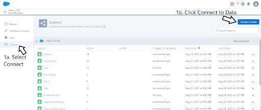
Now it’s time to connect the Snowflake data to TCRM in five simple steps:
- Navigate to the “Connect” tab on the Data Manager in TCRM and click on “Connect to Data.”
- Select “Input Connections” and add a connection.
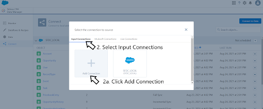
- Select “Snowflake Direct Connector.”
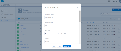
- Once selected, you will need to provide details for the connections: Connection Name, Developer Name, Description, Schema, Password, Database, Warehouse, Username, and Account.

- Now you just need to select “Save & Test” and your connection is set up!
Visualizing the Data in a TCRM Dashboard
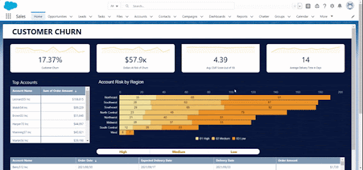
Now that we’ve connected Snowflake, we can get started on creating a dashboard. While talking further with Jake and Elaine, our amazing team of Analytics Consultants identified four key metrics that should be included on the dashboard:
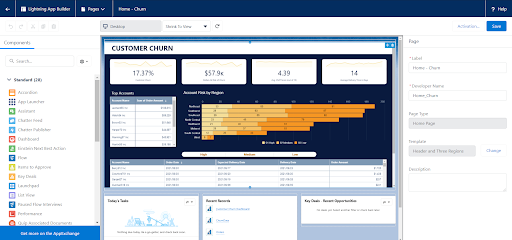
Churn Rate: The percentage of customers that have attritted or reduced their ordering by 75% in the last month.
Amount of Pipeline at Risk: The dollar amount of pipeline at risk by those with high churn likelihood determined by our data science model.
Average Customer Satisfaction Score: The average the most recent Net Promoter Score brought in from our Customer Service system.
Average Delivery Time: The average amount of time between order and delivery dates.
Using TCRM, Elaine can quickly look at where she was in December of 2020 and toggle between customers that our model has determined are of high, medium, or low risk to churn.
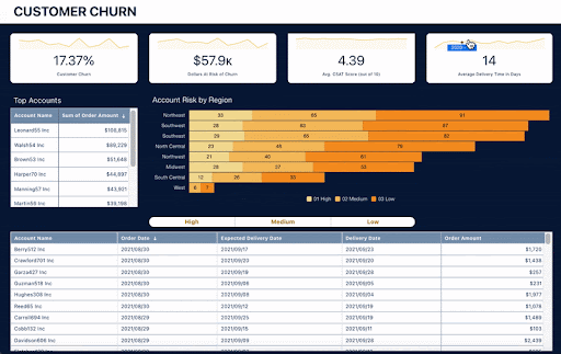
In addition to those four key metrics, another one of Elaine’s pain points is that she is unable to visualize her team’s accounts by region. She wants to see all of the accounts in each region segmented by their likelihood to churn. Elaine’s team members would also like to see a detailed table of customers, their most recent order, and their churn potential.
This centralized data hub integration into TCRM is just the tip of the iceberg for Elaine and Magenta, Inc. By integrating two systems, we have given Elaine dashboards that put the data her team needs to stop customer churn right in front of them.
Embedded Experience: Making Your Dashboard Front of Mind for Your Team
Now that our churn dashboard has been designed and built based on the sales team’s needs, the last (but certainly not least) step of this project is embedding the dashboard into an easily-accessible location. A key element of any successful product launch or platform improvement is a well-executed “Intelligent Experience” for the end user. This means taking the time to assess the processes, experiences, and decisions of the user, then providing tools that empower them to be more efficient and act with greater confidence as they take action and make new decisions. Too often, talented teams of architects and data scientists can trip at the finish line if they fail to consider this final element of “Intelligent Experience” and don’t ask the question “how will the user access and interact with the data?”
Based on Elaine’s pain points mentioned in the first blog post, it appears that the newly combined data and dashboard would best serve her and her team if it was the first thing they saw when they logged on to their Salesforce accounts. Thankfully, Salesforce makes it easy to embed your Tableau CRM dashboard onto the home page of your sales app.
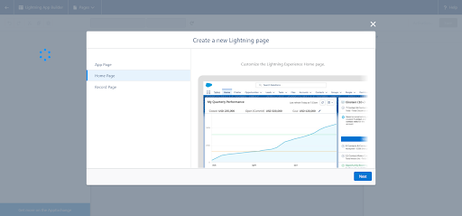
To embed your dashboard onto the homepage of your app, navigate to “Setup” in Salesforce and search for “Lightning App Builder” in the “Quick Find” search box. On the Lightning App builder page, you may see previously-built Lightning apps that can be edited, cloned or deleted. For this example, click the “New” button at the top of the page. You will then be redirected to the builder to begin designing your new home page.
From the options listed, select “Home Page”.
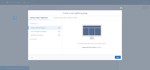
For your lightning page layout, you can select one of three standard templates, or choose a custom layout, as well as clone a default page. For this example, we’ll choose “Header and Three Regions.”
Once you are in the app builder, make sure you give the page a label and developer name on the right side panel. Then, it’s as simple as dragging components and dropping them in the component areas. In our case, we will drag the Tableau CRM dashboard component to the top of the page and select the dashboard you want to display. You can then edit this component on the format panel on the right side of the page. For our home page, we increased the height to 700, and unchecked the “Show Title” and “Show Header” boxes, to give the dashboard a cleaner look.
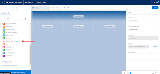
Next, we added three other components below the dashboard: Today’s Tasks, Recent Records, and Key Deals. When creating dashboards such as this, make sure that you add components that will be most useful according to the end user.
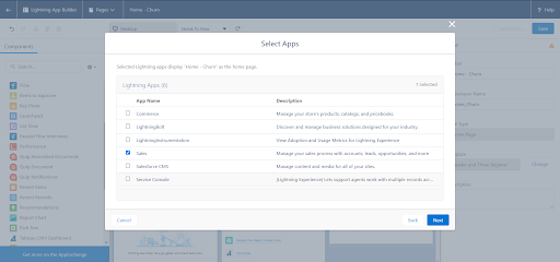
Almost done! Now you’ll save the page, and activate it. When you activate it, you can choose to make it the Org Wide Default Home Page, or you can make it the home page of the apps of your choosing. In this case, we selected the Sales App, since this was specifically designed for the Magenta Sales Reps.
And there you have it! All of your hard work of determining the needs of your stakeholders, combining data in Snowflake, and building a customer churn data model is now displayed in a dynamic and interactive dashboard that can be conveniently accessed on the home page. The sales reps can now be better informed about the delivery of their sales and the satisfaction of their customers, which will hopefully lead to better collaboration with the Service team and a higher number of retained customers.
And just like that, Atrium has brought data directly into the hands of Elaine and her team at Magenta to help them stop customer churn before it even begins.
Find out how Atrium can help you tackle customer churn.